
Original Grains "OG Grains” Branding and Web Design
Role: Brand Identity, Web Design, Creative Direction, Experience Designer
Timeline: 2025 - In Progress
Type: Brand and Web design
Inspired by organic Midwest farming culture and heritage milling traditions, Original Grains explores branding through rustic typography, natural textures, and handcrafted visual design. I created the brand identity and web design system to capture the feeling of locally made, small-batch products while balancing authenticity with a modern digital presence.
project overview / the idea
The Original Grains brand began with the goal of creating a visual identity that felt rooted in heritage craftsmanship while still appealing to a modern audience. The client specifically wanted a circular logo system that incorporated Old English-inspired typography, drawing inspiration from traditional grain mills, vintage packaging, and Midwest agricultural culture.
From the beginning, I wanted the brand to feel organic, farm-to-table, and authentic without appearing overly rustic or outdated. The challenge was finding a balance between heritage-inspired design and a cleaner, more elevated modern aesthetic that could translate across packaging, digital platforms, and marketing materials.
creative direction / moodboarding
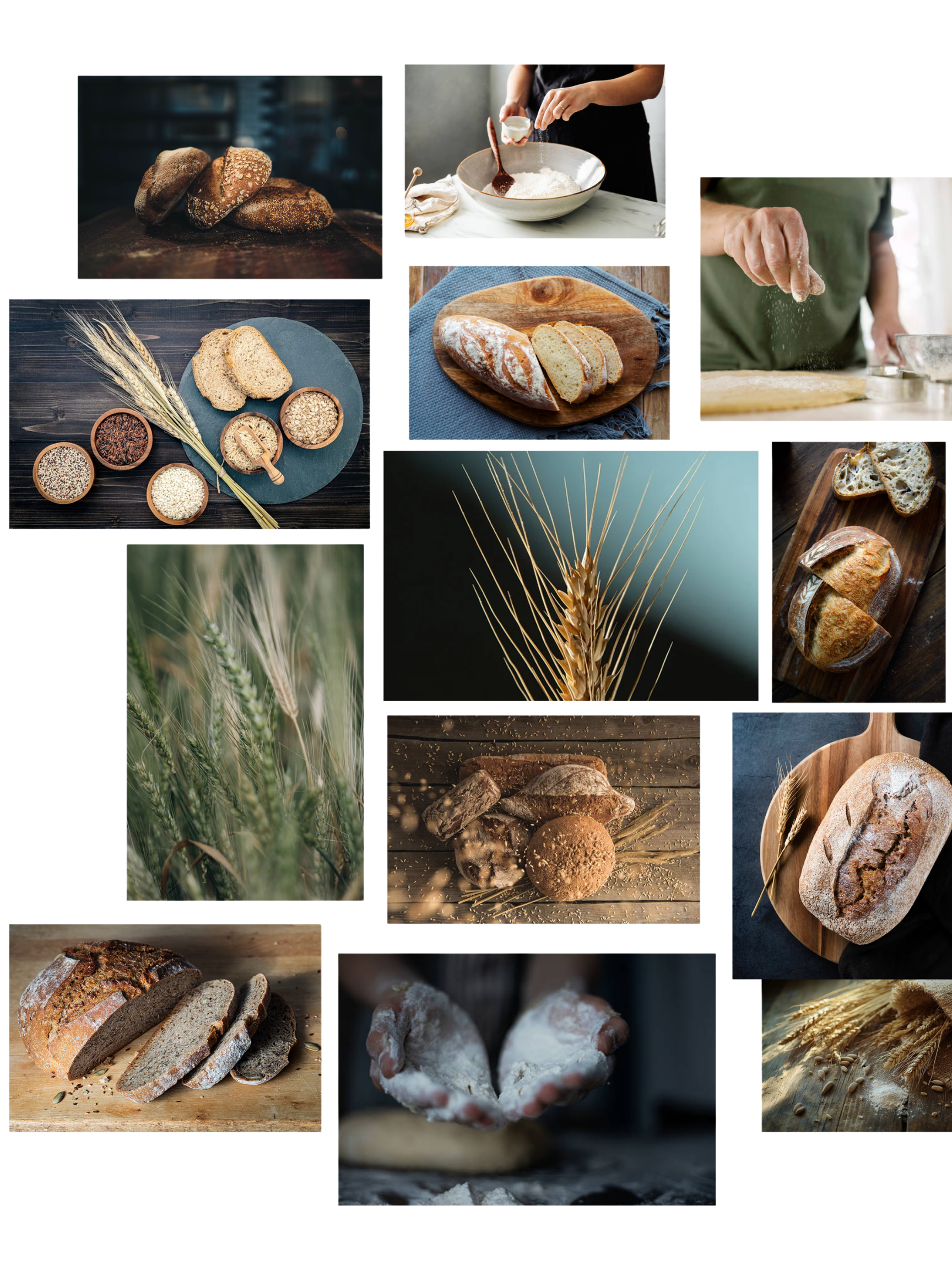
The early creative direction for Original Grains was inspired by organic Midwest agriculture, artisan breadmaking, and heritage milling culture. I focused on warm natural textures, handcrafted preparation, rustic wood tones, wheat imagery, and cinematic food photography to create a brand that felt authentic, grounded, and farm-to-table. I intentionally avoided making the identity feel overly polished or commercial, instead emphasizing imperfect textures and natural storytelling while still maintaining a refined modern edge.
The direction evolved around three core themes:
Heritage craftsmanship
Organic simplicity
Modern farm-to-table branding
identity development / iterations
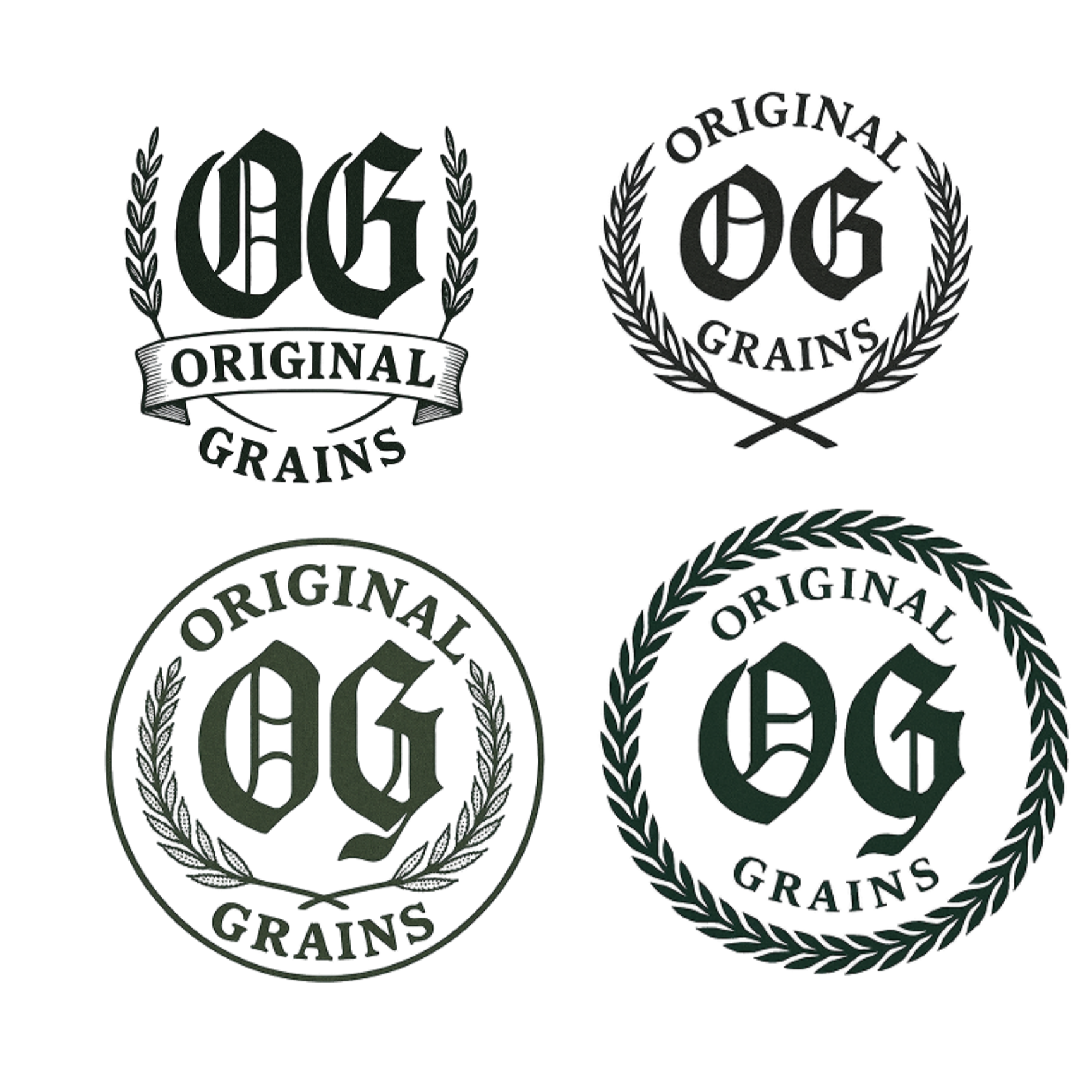
With the overall creative direction established, I began translating those references into a more structured visual identity system. The client wanted a circular logo with Old English-inspired typography, so the early stages of the process focused heavily on logo iteration and experimentation. I explored multiple badge layouts, typography pairings, grain-inspired details, and vintage stamp compositions to find a direction that felt both recognizable and authentic to the brand.
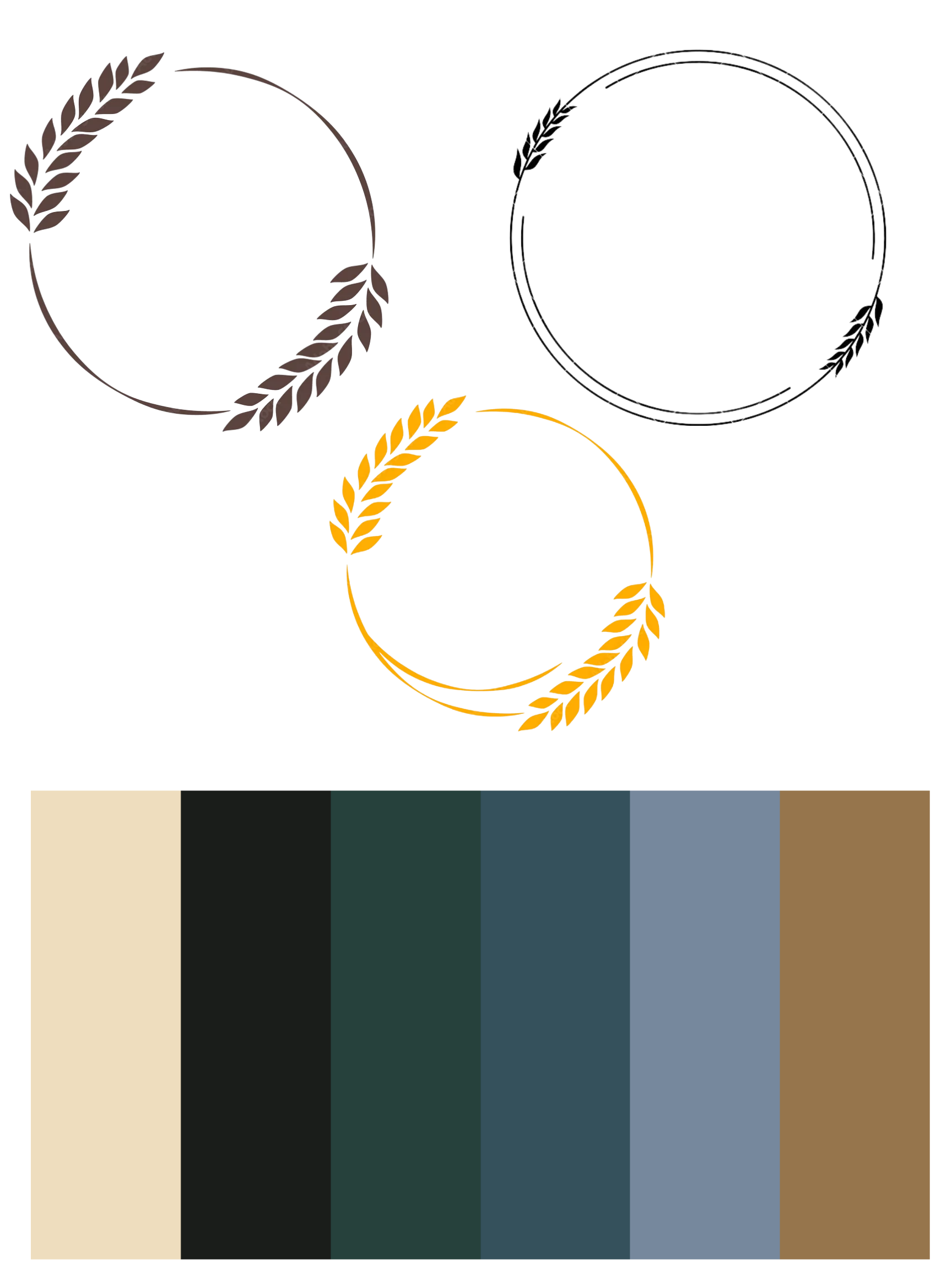
A large part of the refinement process was balancing traditional influences with a cleaner, more modern presentation. Some concepts leaned too rustic, while others felt too minimal, so I adjusted typography, spacing, and composition throughout each iteration to create a stronger balance between heritage and modern design. I also introduced a darker, earthy color palette inspired by grain, soil, aged wood, and natural ingredients to give the identity a richer and more elevated feel.
The final identity system was designed to work consistently across packaging, merchandise, and digital applications while still feeling handcrafted and distinctive.
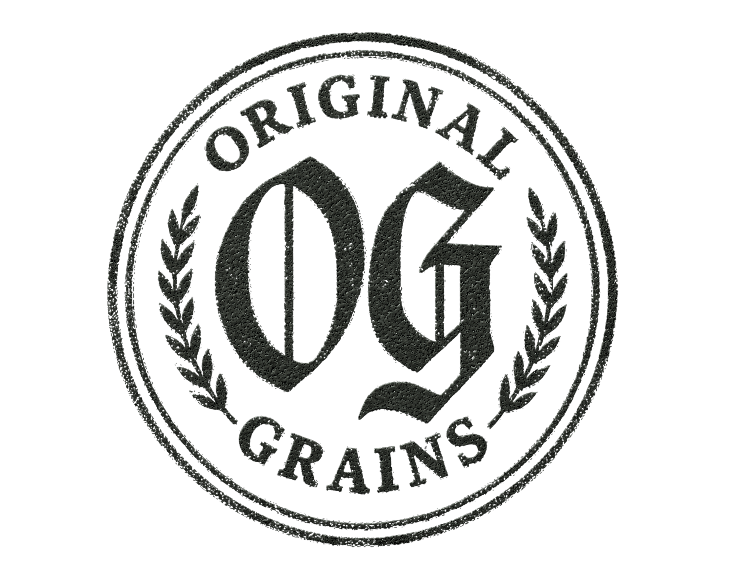
final logo

final logo (stamped effect)
before and after - website redesign
After developing the visual identity, I redesigned the Original Grains website to better align with the updated brand direction and create a more cohesive digital experience. The original website had been initially created by another designer, but it lacked the strong visual identity and atmosphere established through the branding process.
My redesign focused on translating the heritage-inspired brand system into a cleaner and more immersive web experience through typography, layout, spacing, and color. I incorporated darker earthy tones, oversized serif typography, and minimal layouts to strengthen the brand presence while improving the overall visual flow of the site. The goal was to create a digital experience that felt more intentional, modern, and aligned with the organic Midwest identity of the brand.
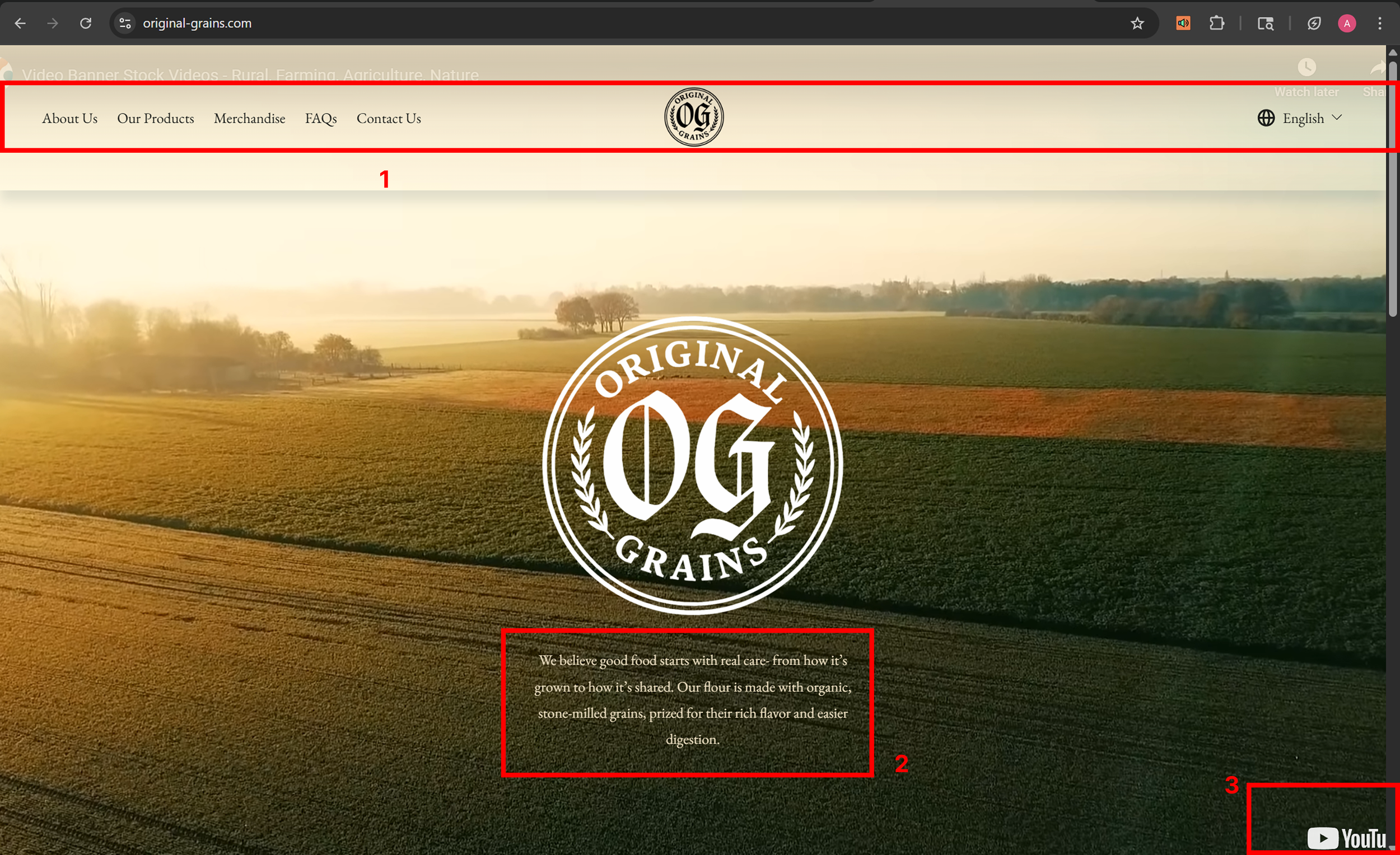
original website homepage
1) homepage navigation refinement
The original homepage navigation felt visually disconnected from the rest of the brand identity and competed with the hero imagery rather than supporting it. I redesigned the navigation structure to create a cleaner hierarchy and a more intentional entry point into the website experience. The updated direction focused on simplifying the layout, improving spacing, and allowing the branding elements to feel more integrated within the page.
2) hero section
The original hero section relied heavily on background imagery, but the supporting text lacked enough visual emphasis and readability. During the redesign process, I explored stronger typography treatments and more intentional call-to-action placement to improve user engagement and create a clearer focal point within the homepage experience.
3) youtube logo visible
The original homepage used an embedded YouTube video that displayed visible controls and branding throughout the hero section. This distracted from the website experience and made the page feel less polished, so part of the redesign focused on creating a cleaner and more immersive landing page.
updated homepage
website redesign contd.
original product page
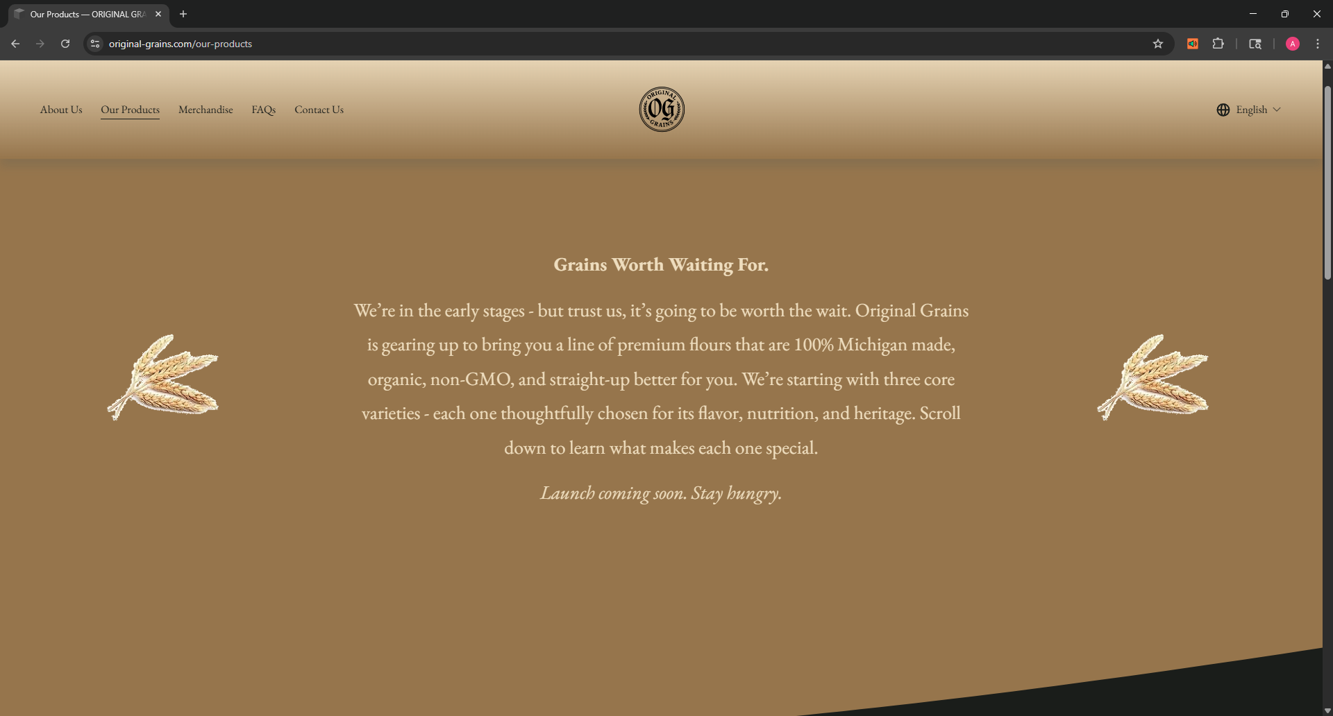
original product page cont.
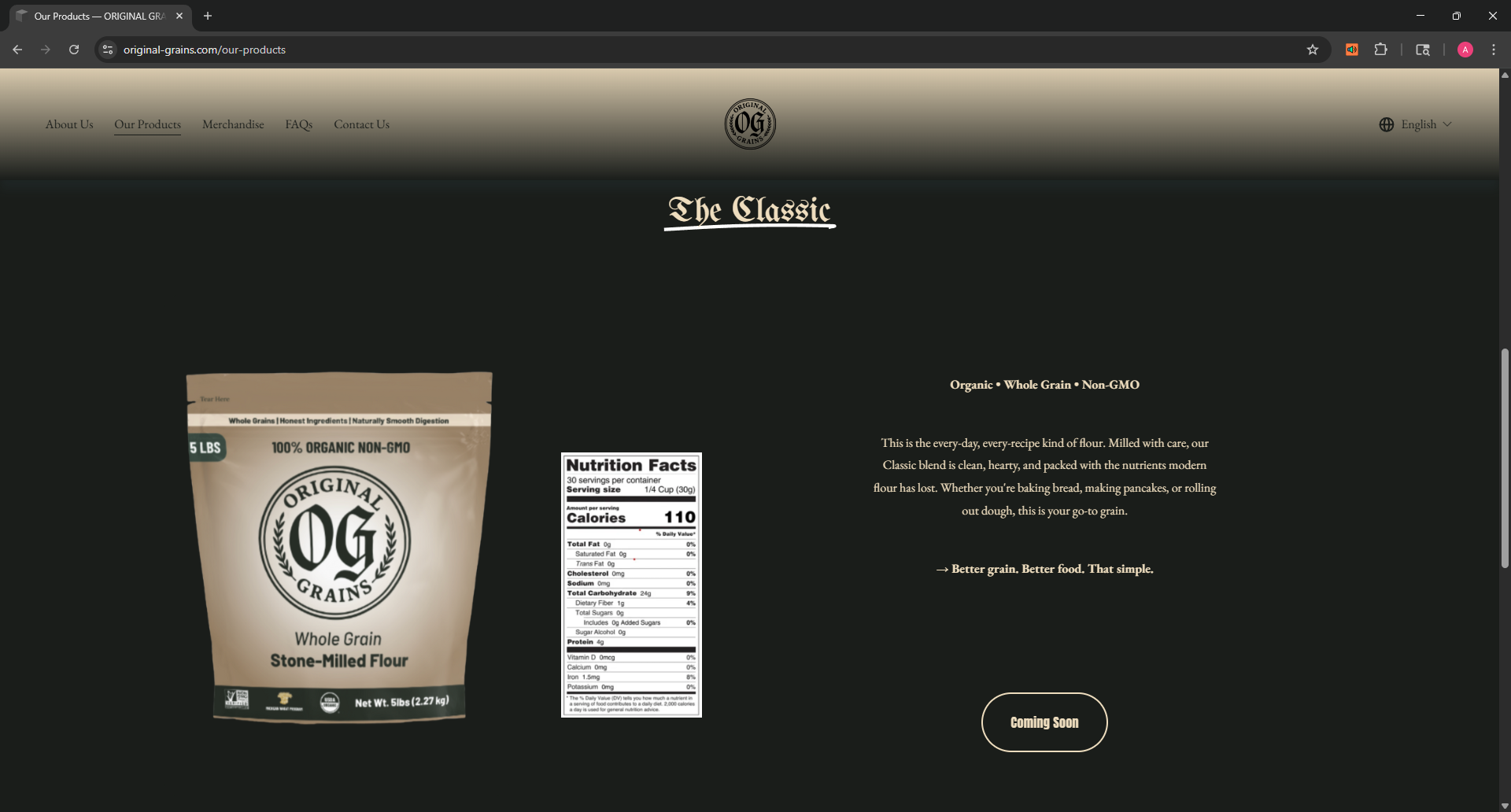
1) simplifying product info
The original layout displayed the nutrition facts directly on the page, which made the interface feel more cluttered. In the redesign, the nutrition facts were moved into a dedicated button interaction to create a cleaner and more organized product page.
2) stronger calls to action
The redesigned product page introduced more prominent and functional calls to action, including clearer purchasing and nutrition information buttons. These additions improved usability and created a more realistic e-commerce experience compared to the more conceptual layout of the original iteration.
3) overall design improvements
The redesign focused on making the product page feel cleaner, easier to navigate, and more visually cohesive overall. I refined the layout, spacing, typography, and content organization to create a more polished experience that felt more aligned with the updated brand direction.
updated product page
view final website
Explore the final website redesign and see how the updated brand identity was translated into a cleaner, more modern digital experience.