
ingredia
Stop paying for the label. Start paying for the ingredients.
Most people buy beauty and self-care products based on branding, not what's actually inside them. And most of the time, they’re overpaying.
Ingredia is a self-initiated concept app that matches users with more affordable alternatives based on real ingredient overlap, repurchase frequency, and true cost per ounce - not trends or hype.
Role: Experience Designer
Tools: Figma, React Native (Replit)
Timeline: 2026 - In Progress
Type: Self-Initiated Concept Project
the problem
Beauty and self-care is a space saturated with marketing. Trendy ingredients, influencer sponsorships, and pretty packaging all drive purchasing decisions that have little to do with what is actually inside the product. People consistently overpay, not because better options don't exist, but because they have no easy way to find them. The average person spends hundreds of dollars a year on products they could replace with nearly identical formulas at a fraction of the cost.
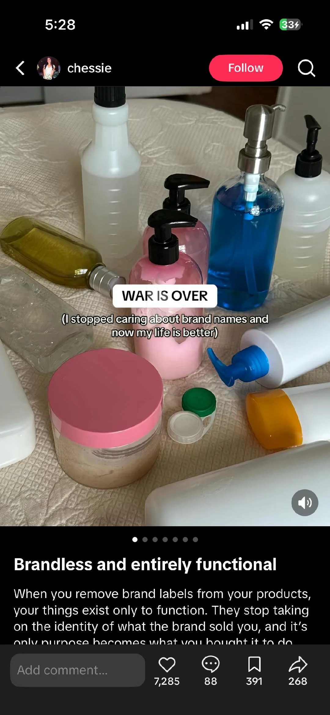
A growing trend on social media captured this perfectly:
People were removing labels from their products entirely, forcing themselves to evaluate them on function alone. Branding had become so powerful it was obscuring the thing that actually mattered.
Existing “dupe” solutions fall short because they rely on surface-level comparisons. They tell you something looks like a dupe. They rarely tell you if it actually is one. Meanwhile, ingredient labels are technically available to everyone but practically accessible to almost no one. Reading them requires knowledge most consumers simply don't have, and calculating true cost across price, size, and how often you repurchase is something almost no one is doing.
Ingredia was designed to close that gap. Not just to find cheaper products, but to show users exactly how much they are overpaying and why a cheaper alternative is genuinely worth switching to.
research
Before designing anything, I focused on understanding who would actually use Ingredia and why. I started by talking to friends and people in my network about their beauty and skincare habits - how they discover products, how much they spend, and whether they had ever tried to find a cheaper alternative. The conversations were consistent. People felt like they were probably overpaying but had no real way to confirm it. Nobody was reading ingredient lists. Nobody knew where to start.
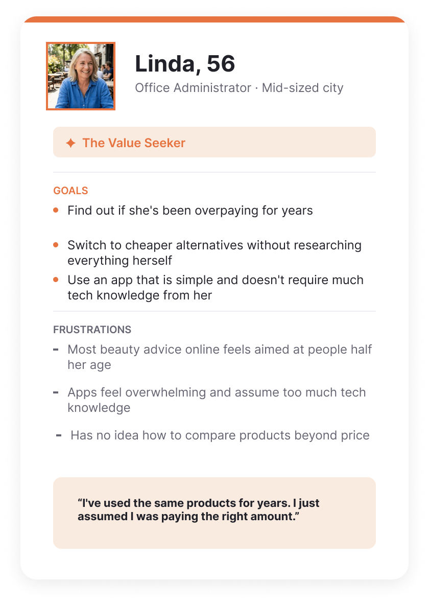
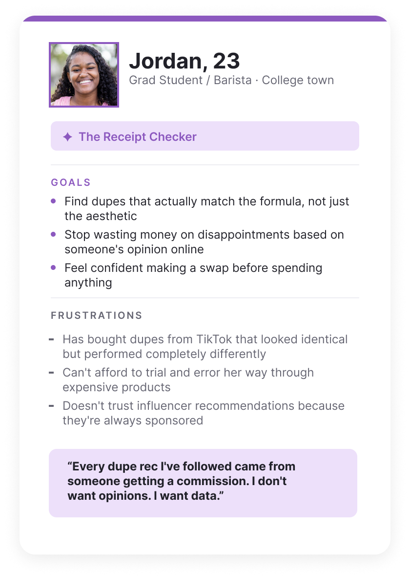
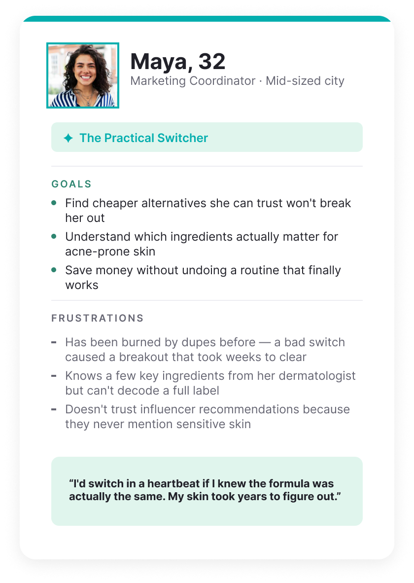
That research, combined with observing a growing cultural conversation on social media around brand skepticism, shaped three distinct personas. Each one represents a different relationship with spending, ingredients, and the decision to switch.
user journey
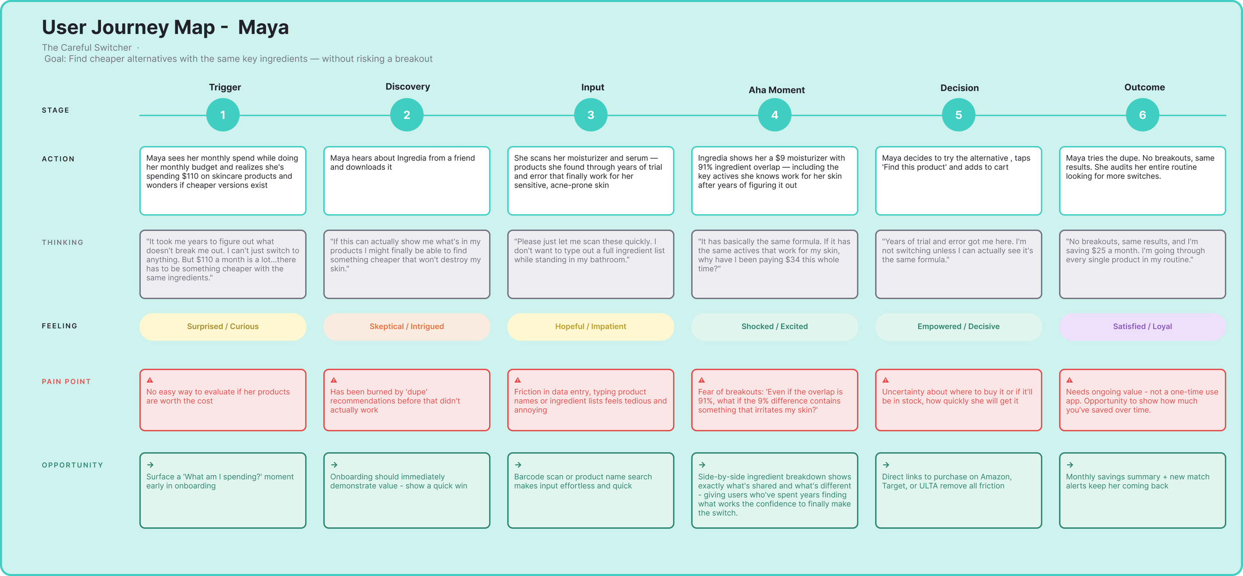
Once I had a clear picture of who I was designing for, I wanted to understand what that experience actually felt like from their perspective. I mapped Maya's journey from the moment she realizes she might be overspending all the way through to making her first confident product swap.
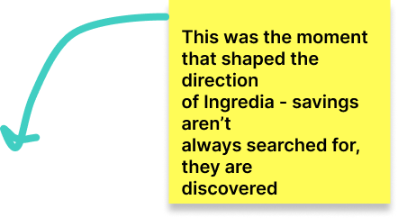
What came out of it was pretty telling. Some users come in already hunting for a dupe. Others are just curious about what they already own and stumble onto the savings from there. Either way, the "aha moment" is the same: seeing exactly what they have been paying for and what they could be paying instead. Getting that moment right became the most important aspect to design around.
design process
The research pointed to one thing above everything else: the “aha!” moment.
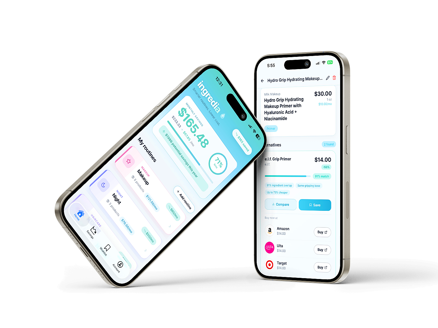
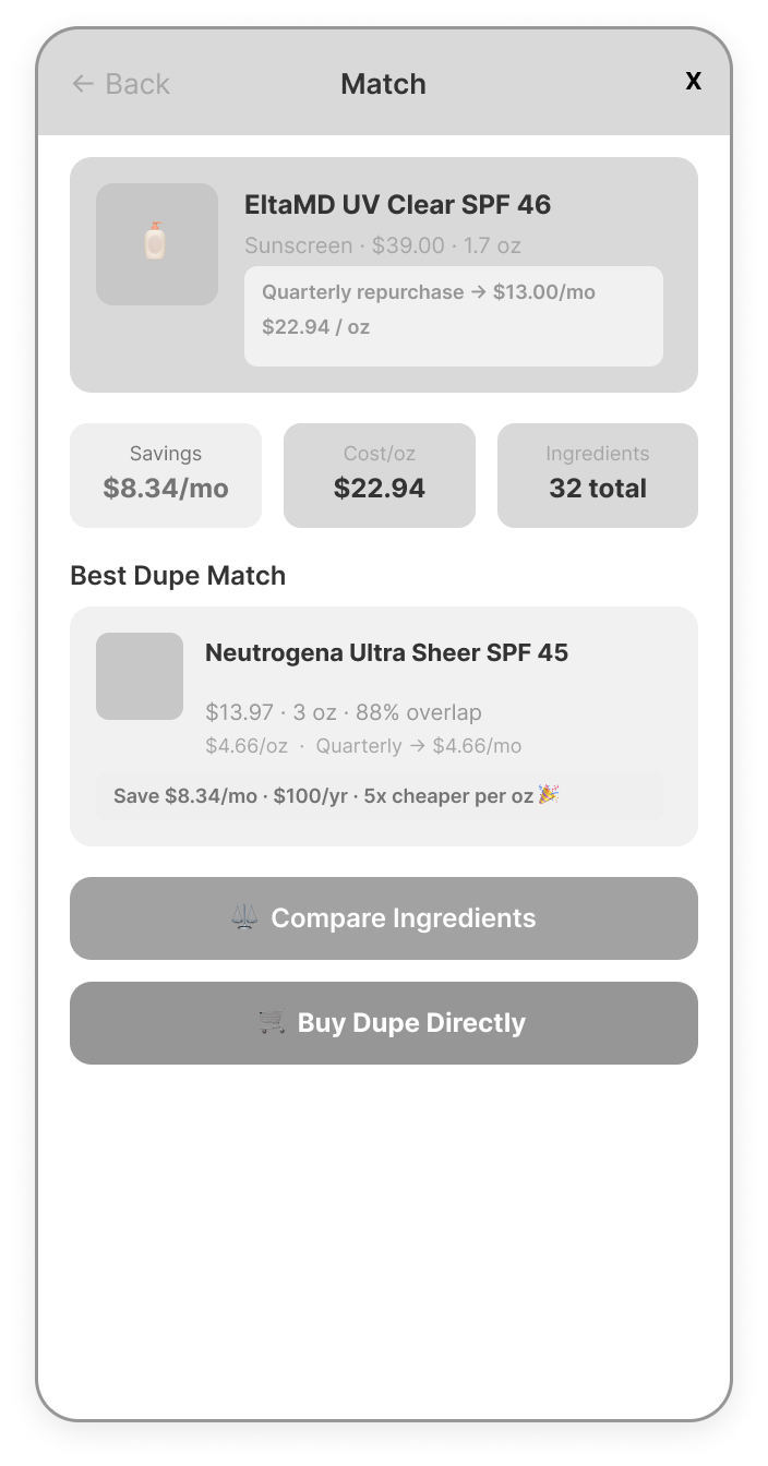
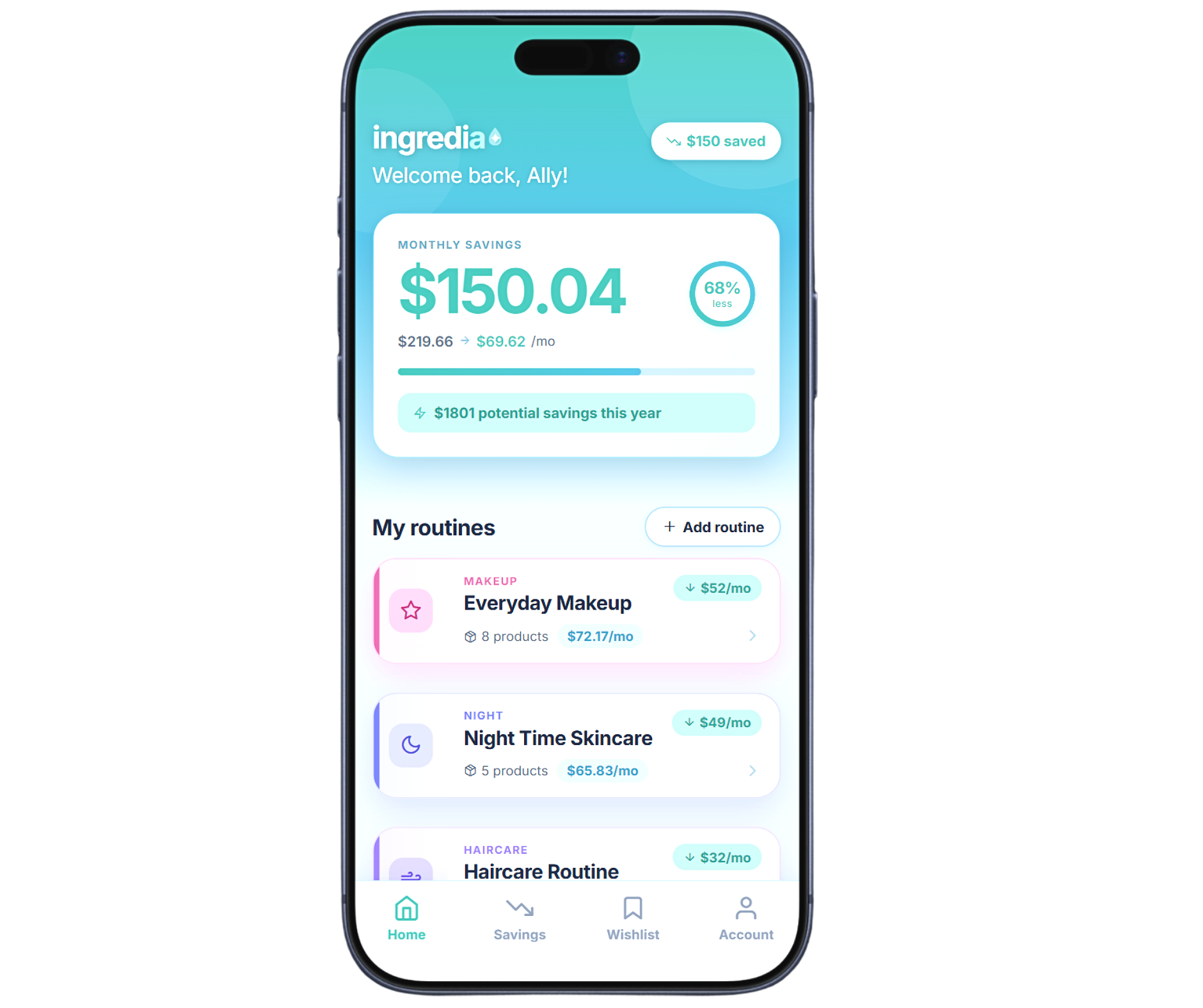
The instant a user sees their $39 sunscreen sitting next to a $13 alternative with 88% of the same ingredients. Everything in the wireframes was designed to get there fast and make it land hard.
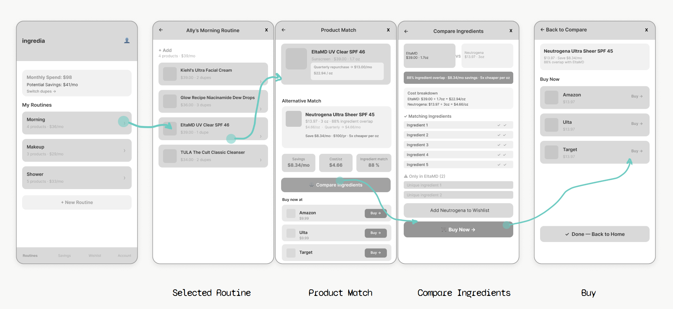
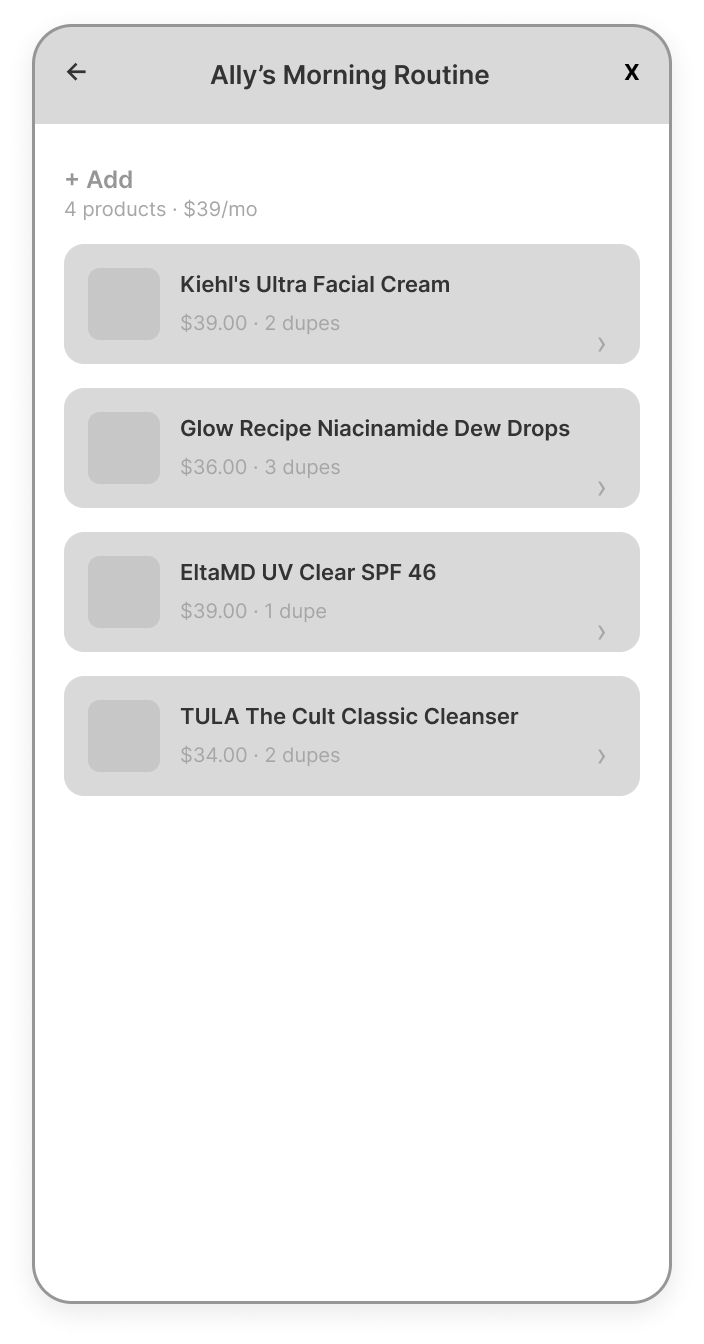
flow a - browse & buy
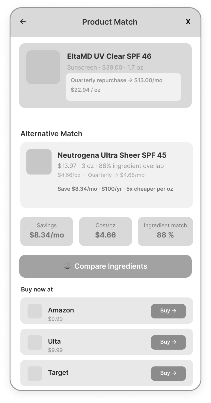
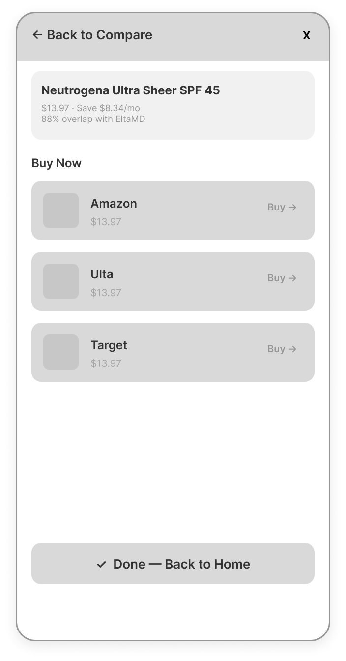
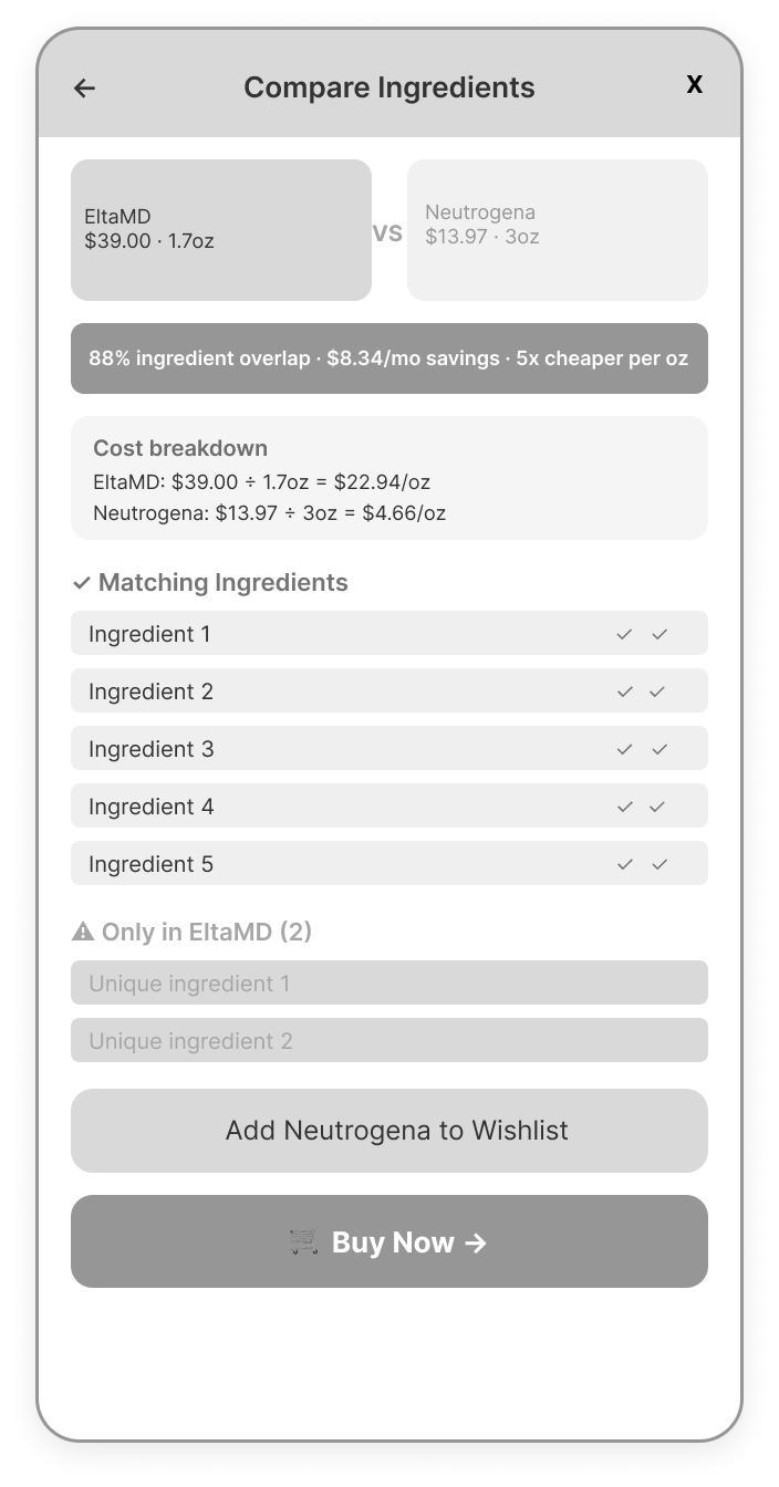
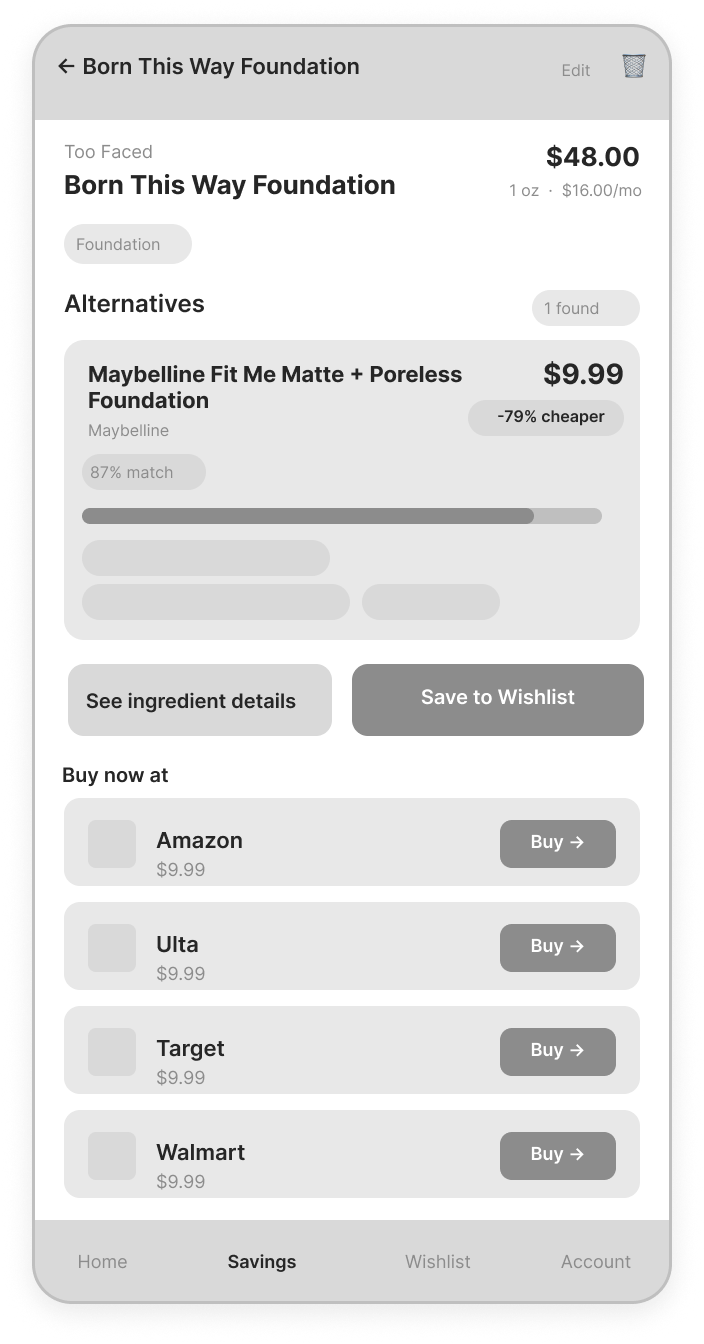
This is the everyday use case. A returning user opens their Morning Routine, taps a product, and immediately sees its best dupe match with a real ingredient overlap score, true monthly cost based on size and repurchase frequency, and a cost per ounce comparison. From there they can compare ingredients side by side or buy the dupe directly through their preferred retailer. The whole flow is designed to get from curiosity to confident decision in as few taps as possible.
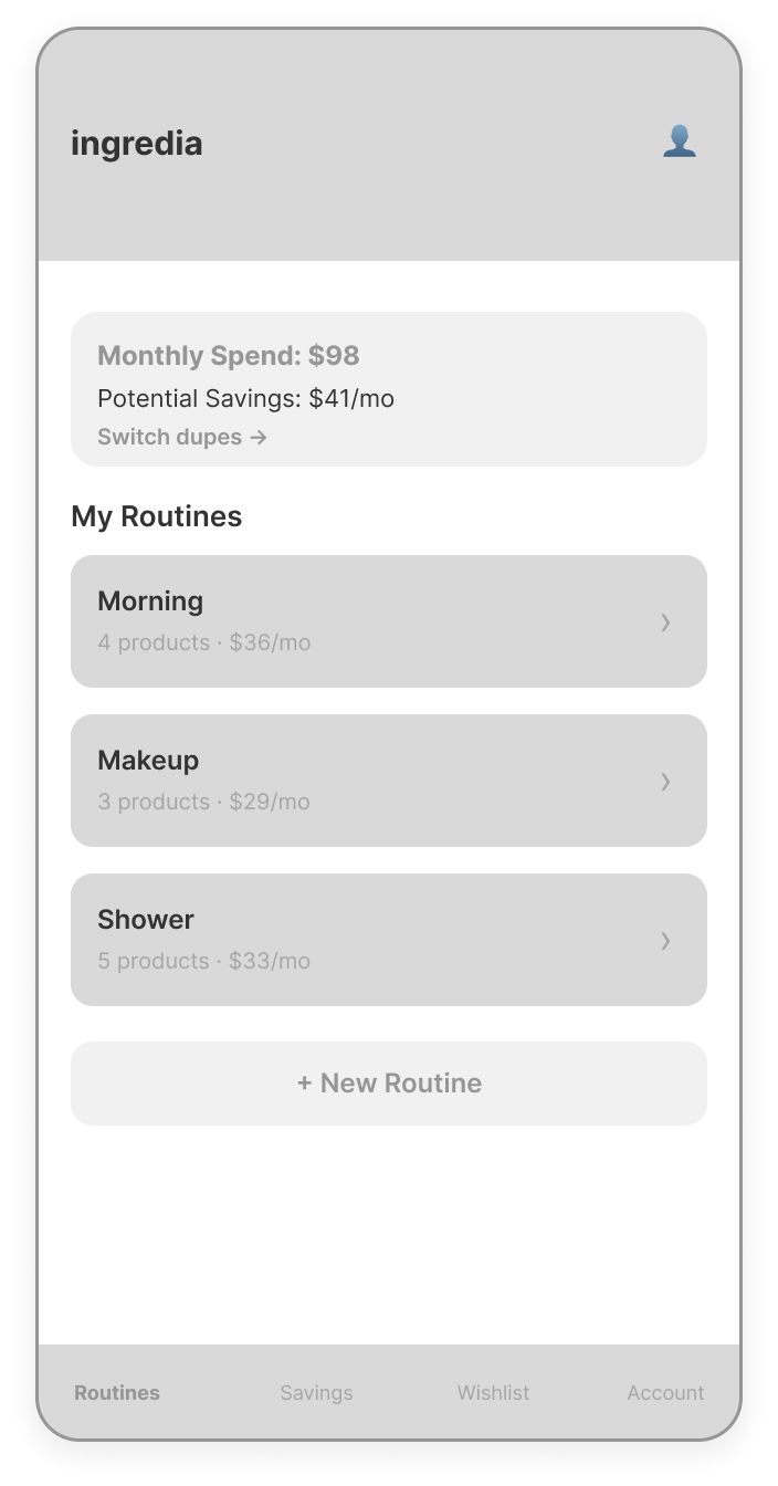
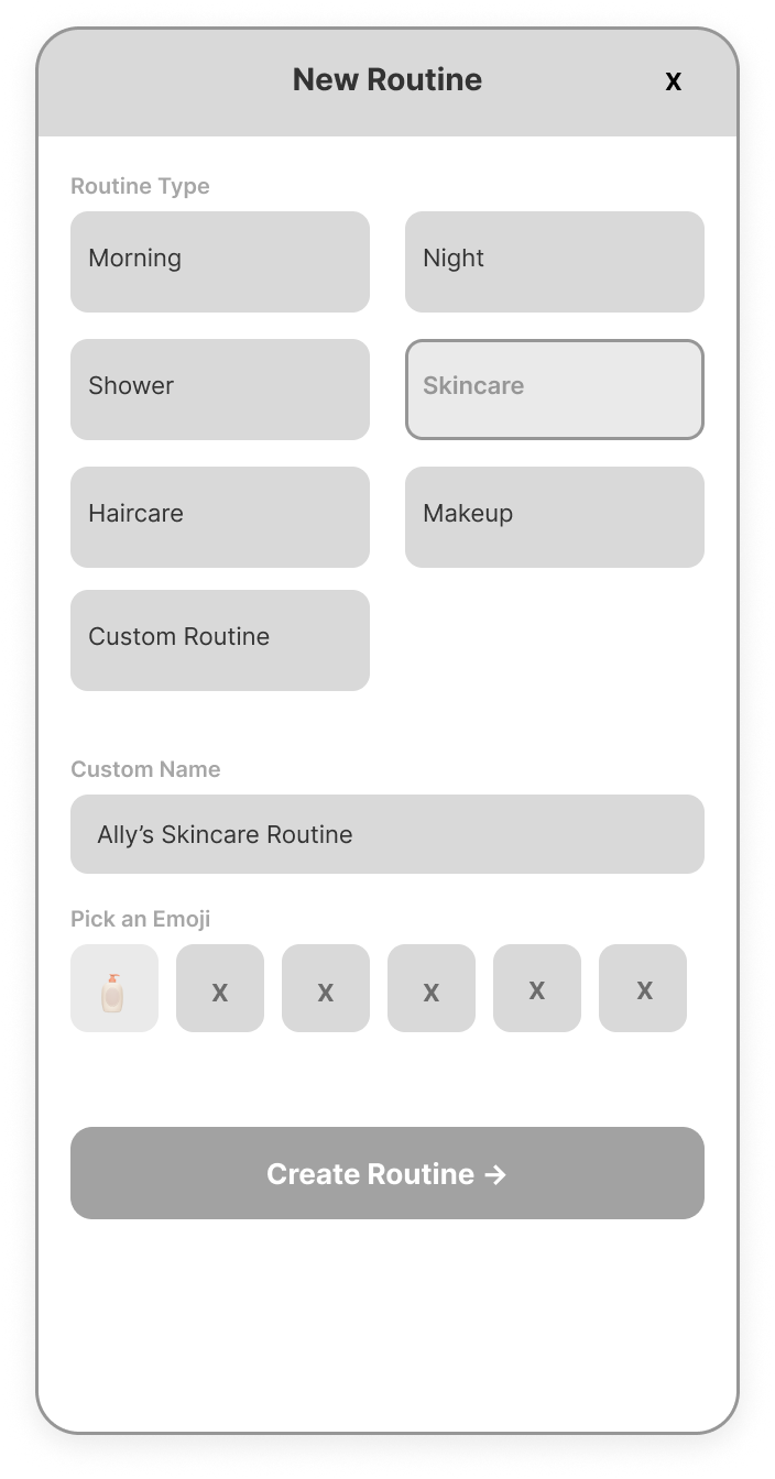
New Routine
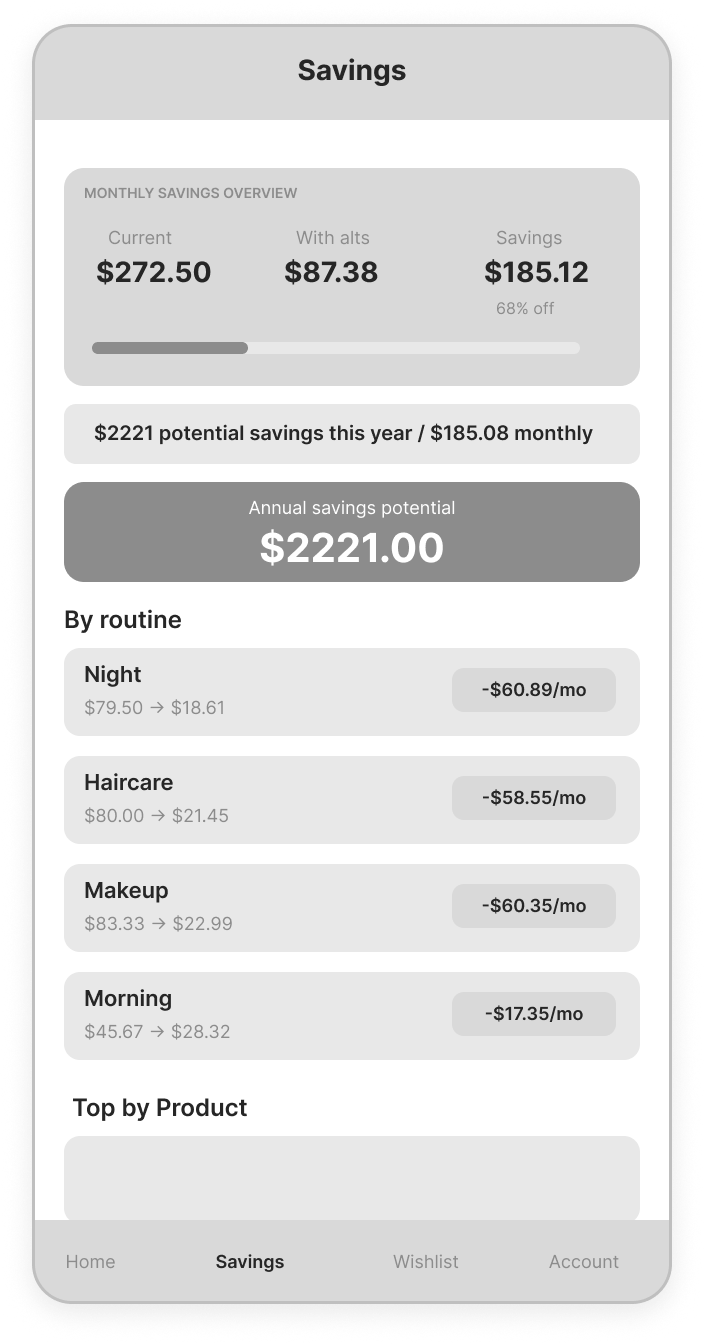
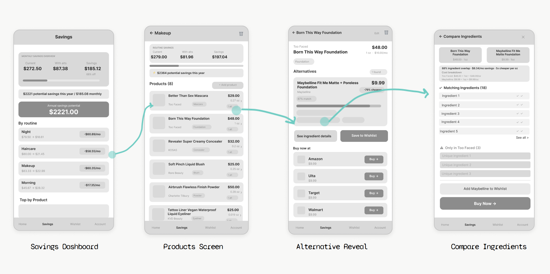
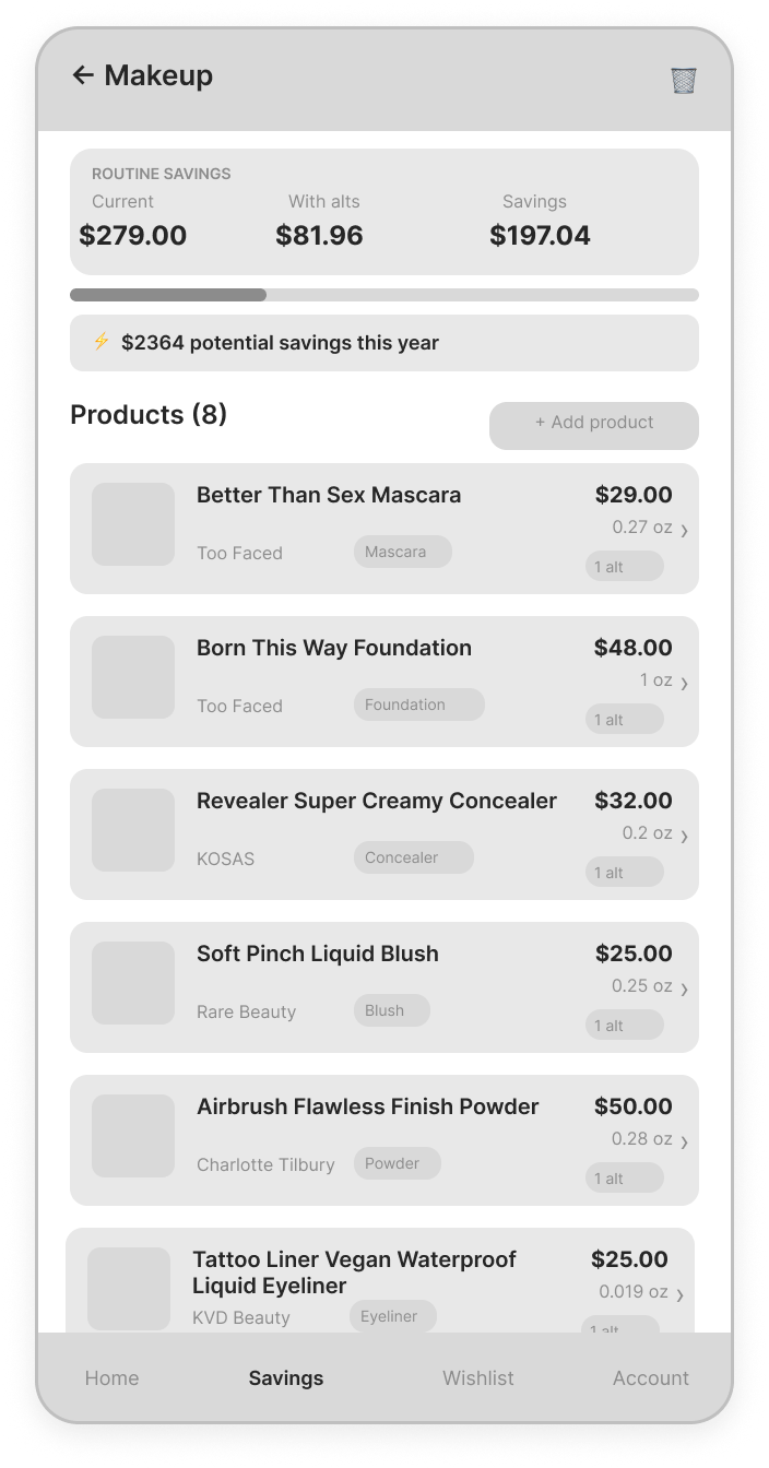
Savings Dashboard
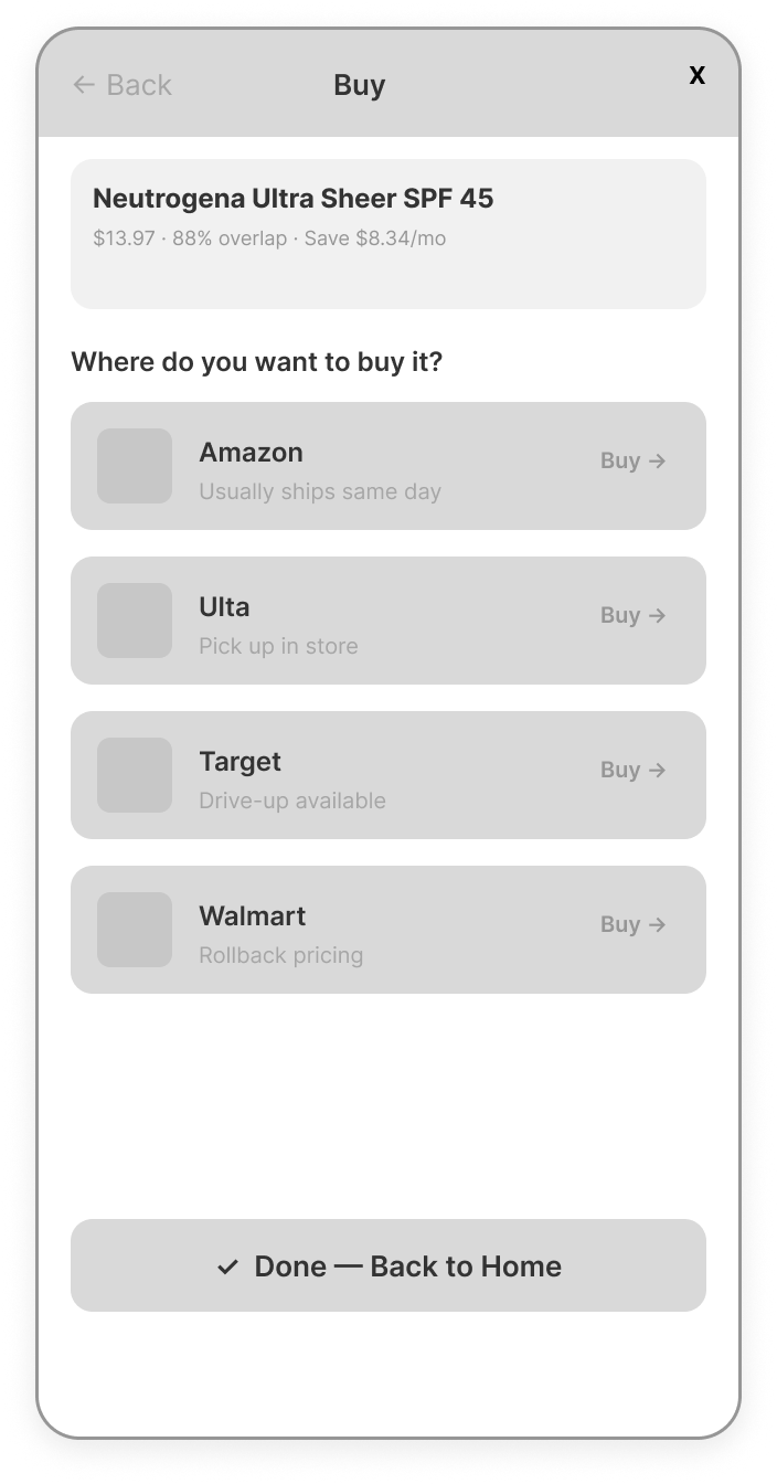
flow b - routine + checkout
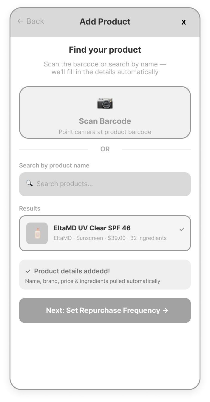
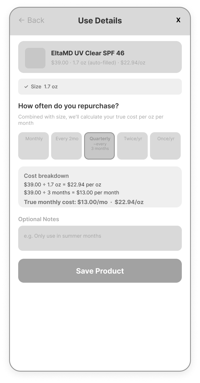
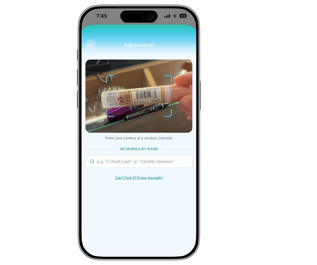
Scan it. Search it. Tell us how often you buy it. The app pulls the product details automatically and uses your repurchase frequency to calculate true monthly cost. That's when the price comparison hits, it’s not price vs. price, but what you actually spend per month vs. what you could. The dupe match shows up immediately so the value is impossible to ignore.
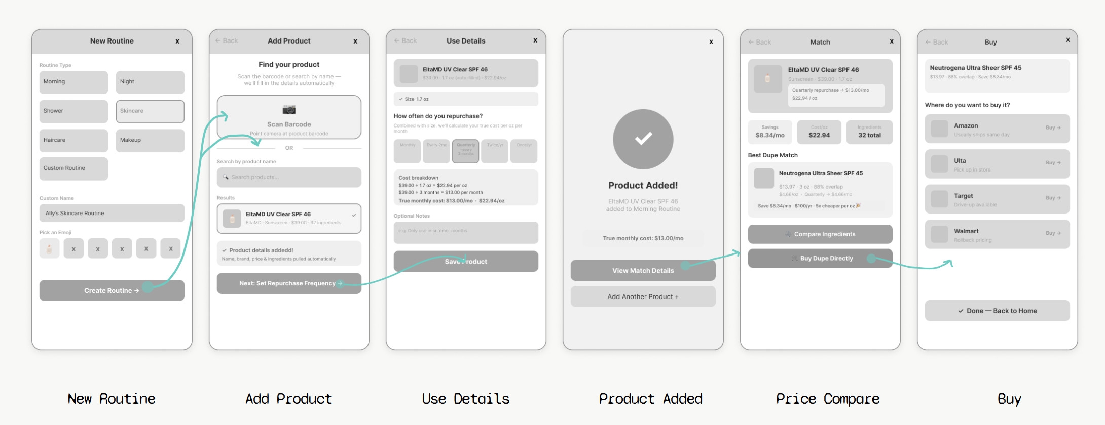

flow c - price + ingredient compare
Open the savings tab and the number is right there : what you're spending, what you could be spending, and the gap between the two. Tap into a routine, find the products with cheaper alternatives, compare ingredients to make sure the swap actually makes sense, and buy it right there. The flow exists to ensure you know what is in your alternative matched product, and has the data to back it up.
Selected Routine

Add Product
Use Details

Products Screen
Product Match

Buy
Price Compare

Buy
Compare Ingredients


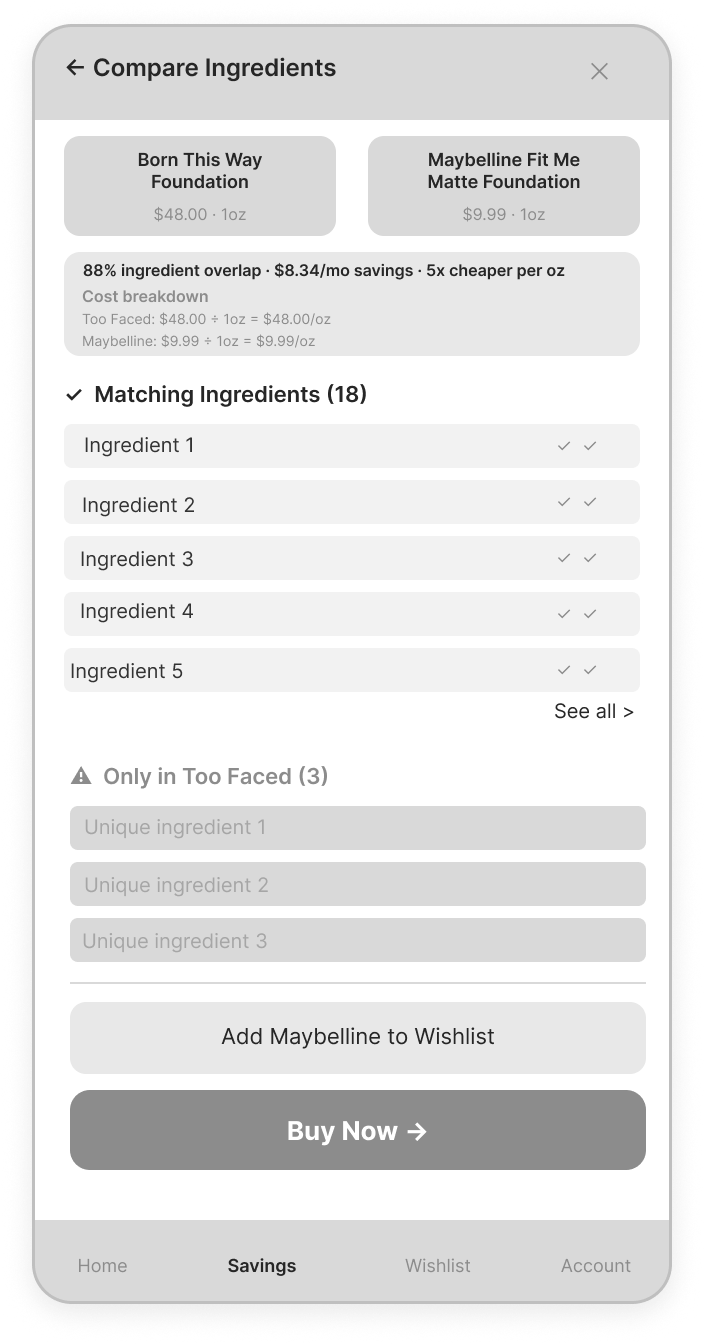
Compare Ingredients
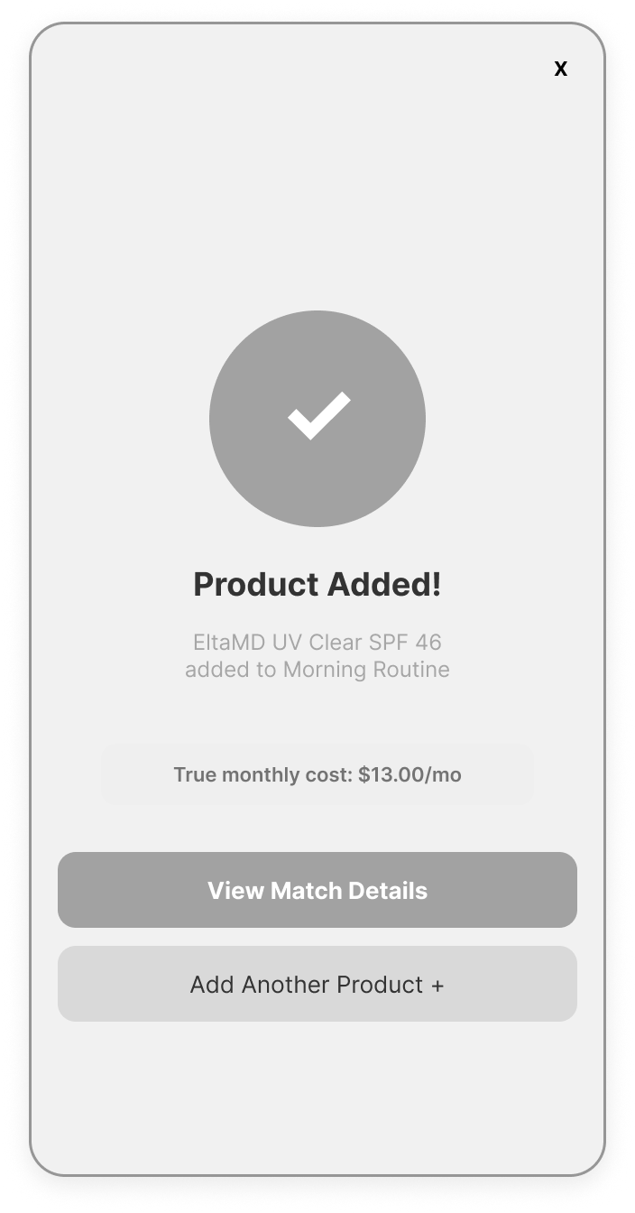
Product Added
Alternative Reveal
key design decisions
decision #1
Nobody is typing out 30 ingredients. Users scan a barcode or search a product name and the app handles the rest. The only thing they fill in themselves is how often they repurchase.
decision #2
Sticker price is misleading. A $39 sunscreen bought quarterly actually costs $13 a month. Ingredia calculates what you really spend, not just what the label says.
decision #3
Cheaper isn't always cheaper. A smaller bottle at a lower price can cost more per ounce than the premium version. Cost per ounce was the only way to make the comparison honest.
decision #4
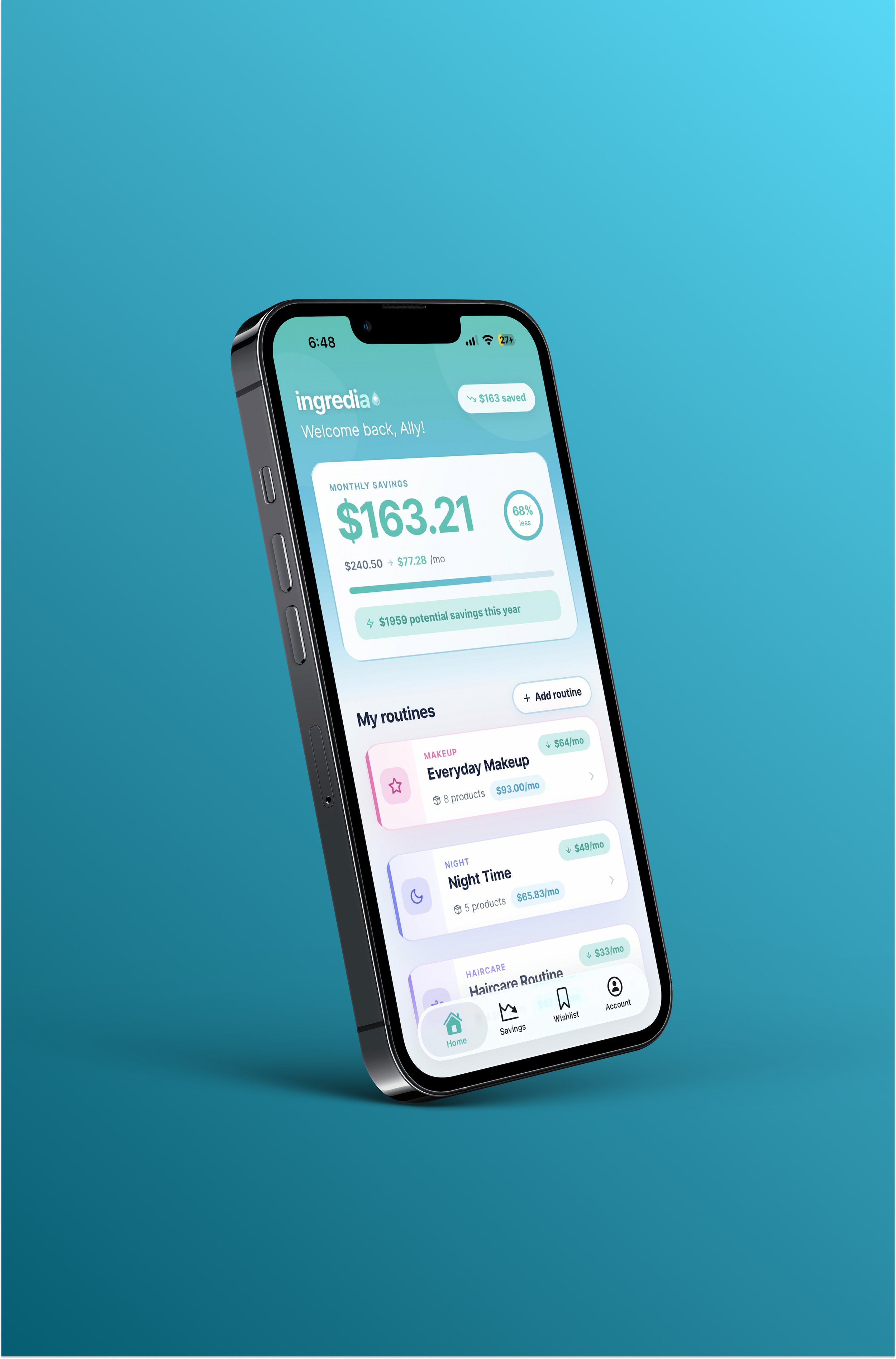
The savings number needed to be the first thing the user sees. It started as a small banner. After testing the prototype, it was obvious that number was the whole reason someone would keep using the app, so I made it the loud hero.
decision #5
Users should be able to buy directly from the app. Instead of just showing a dupe and leaving users to find it themselves, adding direct retailer links so the path from discovery to purchase is never broken and users can compare prices across retailers.
iterations
→
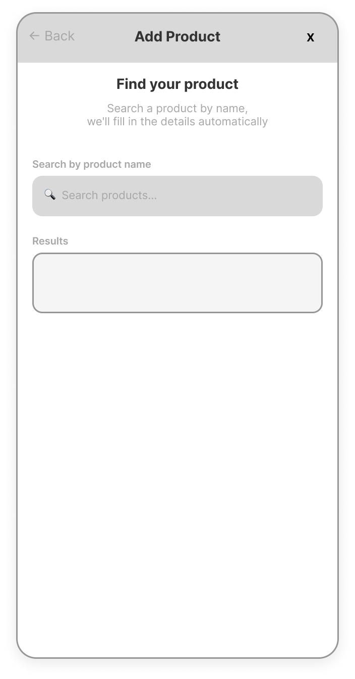
first lo-fi wireframe
updated wireframe
The home screen savings banner → savings hero
The original wireframe treated savings as supporting information, just a small banner sitting above the routine list.
After building the prototype and using it firsthand, it became obvious that the savings number was the emotional core of the whole experience. It was the thing that made the app feel worth opening.
The redesign moved it to the full hero position, making the dollar amount the first and most prominent thing you see. Everything else became secondary to that number.
→
first lo-fi wireframe
updated wireframe
Search to scan: designing for the real moment of use
The very first flow asked users to search for a product by name. But when I thought about the actual moment of use - standing in the shower, going through a makeup bag, hands full - typing anything felt tedious and annoying.
A barcode is already on almost every product. Scanning it takes one second and lets you move straight to the next one. That shift made the setup flow feel like it belonged in the moment rather than interrupting it.
the outcome
A working prototype demonstrating the full Ingredia experience : browsing a routine, discovering a cheaper alternative, comparing ingredients side by side, and reviewing the full ingredient breakdown before directly buying through links.
Ingredia started as a simple question : "How much of your product spend is going toward the formula, and how much is just the packaging and the name?"
This was a self-initiated project, which meant I had to apply everything I learned in my master's program on my own terms - from user research and personas to journey mapping, wireframing, and building a working prototype. Doing it without a prompt pushed me to connect every decision back to a real user need rather than just checking boxes.
The thing I'm most proud of is that every design decision has a real reason behind it. The barcode scan exists because I thought about wet hands in a shower. The savings hero exists because I actually used the prototype and felt what it was missing. The ingredient comparison screen exists because I knew users needed proof, not just a price tag.
reflection
what I would do differently