
Redesigning the Fly Delta eCredits Experience
You earned the credit.
Finding it shouldn't be the hard part.
This project combines a firsthand user experience with UX analysis. Using my own frustrating encounter with the Delta eCredits feature as the starting point, I identified three core usability issues and proposed design solutions grounded in UX principles.
Role: UX Designer & Researcher
Tools: Figma
Timeline: Semester project
Type: Design Critique / Redesign Propsal
the context
I am a frequent Delta traveler. I depend on the Fly Delta app to manage trips, track flights, and stay updated in real time at the airport. When I missed a flight earlier this year (thanks to a silent iPhone alarm I will not be forgiving anytime soon), Delta issued me an eCredit, which seemed simple enough. Finding it in the app after the fact was anything but simple.
When I finally located the eCredits section after digging through several menus, the page wouldn’t load…no information, no guidance, just an error screen. With no way to access the eCredits I had earned, I called customer service. After fighting through several minutes of automated menus, AI assistant bots, and being on hold, I finally reached an actual person. The call took over an hour. I had to then go to my email, copy the eCredits code myself and paste it manually in the app. By the time it was resolved with little help from customer support, the rebooking window for another flight I could have taken had already closed.
That experience is what motivated this critique. eCredits become most important exactly when travel plans fall apart, the most stressful and time-sensitive moments a traveler can face.
That is the exact moment when this feature needs to work quickly and efficiently and right now, it doesn't.
the problem(s)
problem #1
eCredits are hard to find.
eCredits are buried inside the Wallet section under Account, several taps away from anywhere someone would naturally look when trying to rebook. Most users would expect to see their available credits inside a trip, during checkout, or somewhere clearly labeled. Not hidden three levels deep in a profile menu.
problem #2
It doesn't work when you find it.
The dedicated eCredits page in Wallet frequently fails to load entirely, showing only a generic error message with no guidance on what to do next. For a feature tied to real money users have already spent, this is not a minor bug.
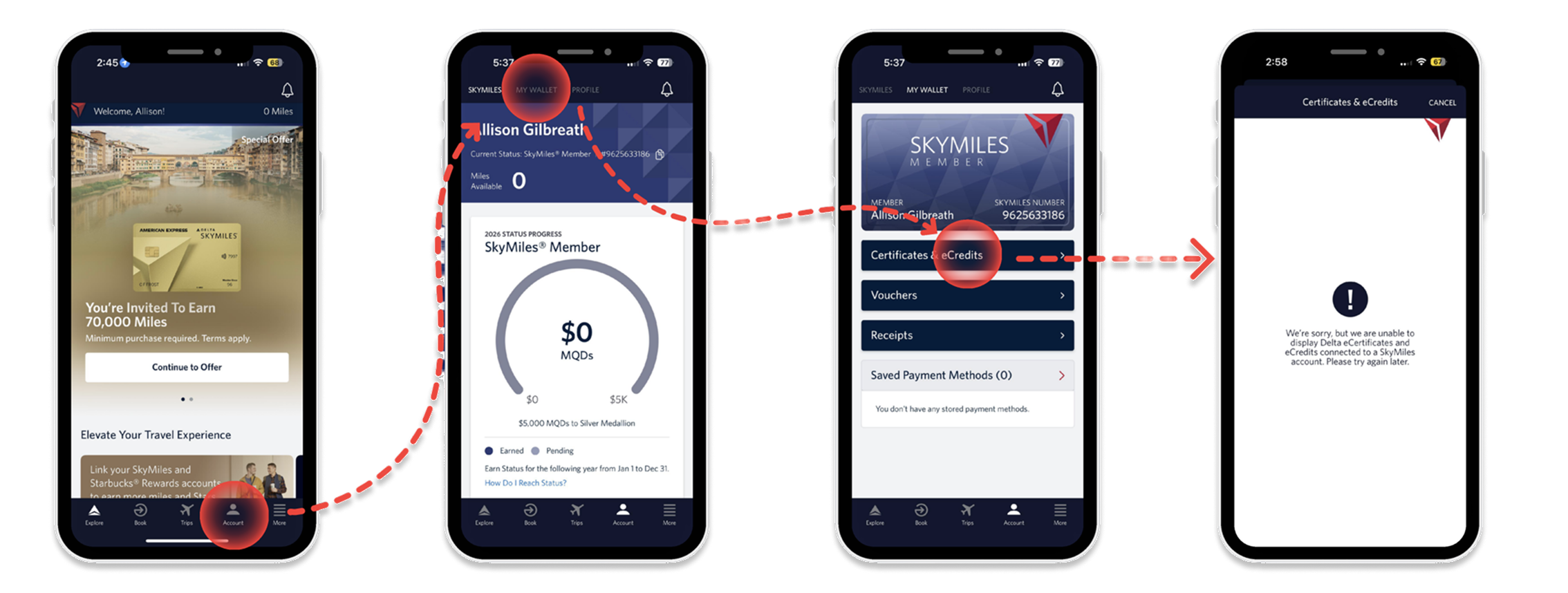
The current flow of finding eCredits is four screens that lead to a feature that doesn’t load.
problem #3
It forces unnecessary effort.
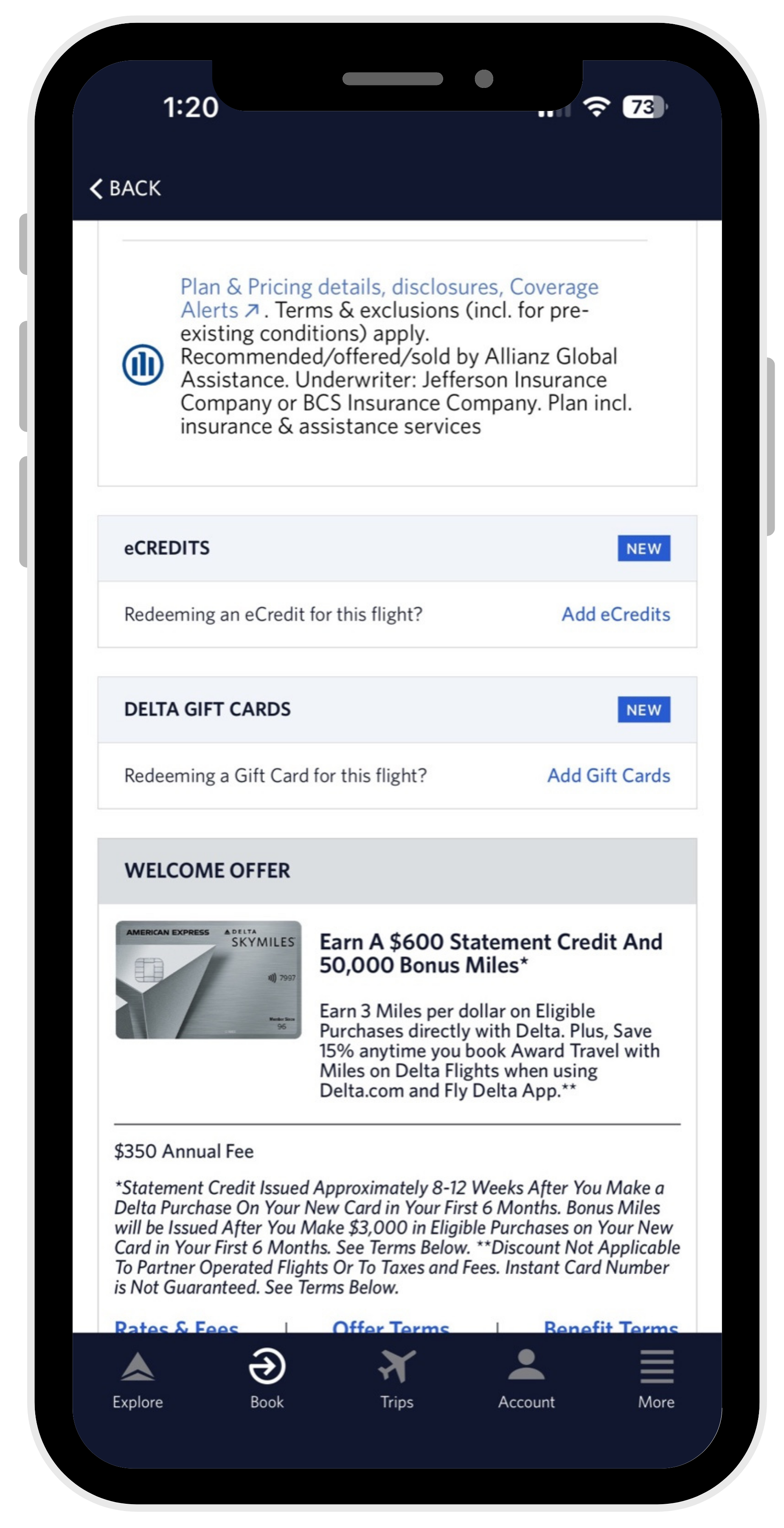
When users finally find the eCredits section, they are left with no choice but to leave the app, search their email for an eCredit code they may have received weeks ago, copy a long code, return to checkout, and enter it manually. Every one of those steps adds friction at exactly the moment when a traveler needs clarity and speed. This friction is also extremely difficult for flyers who are less tech-savvy.
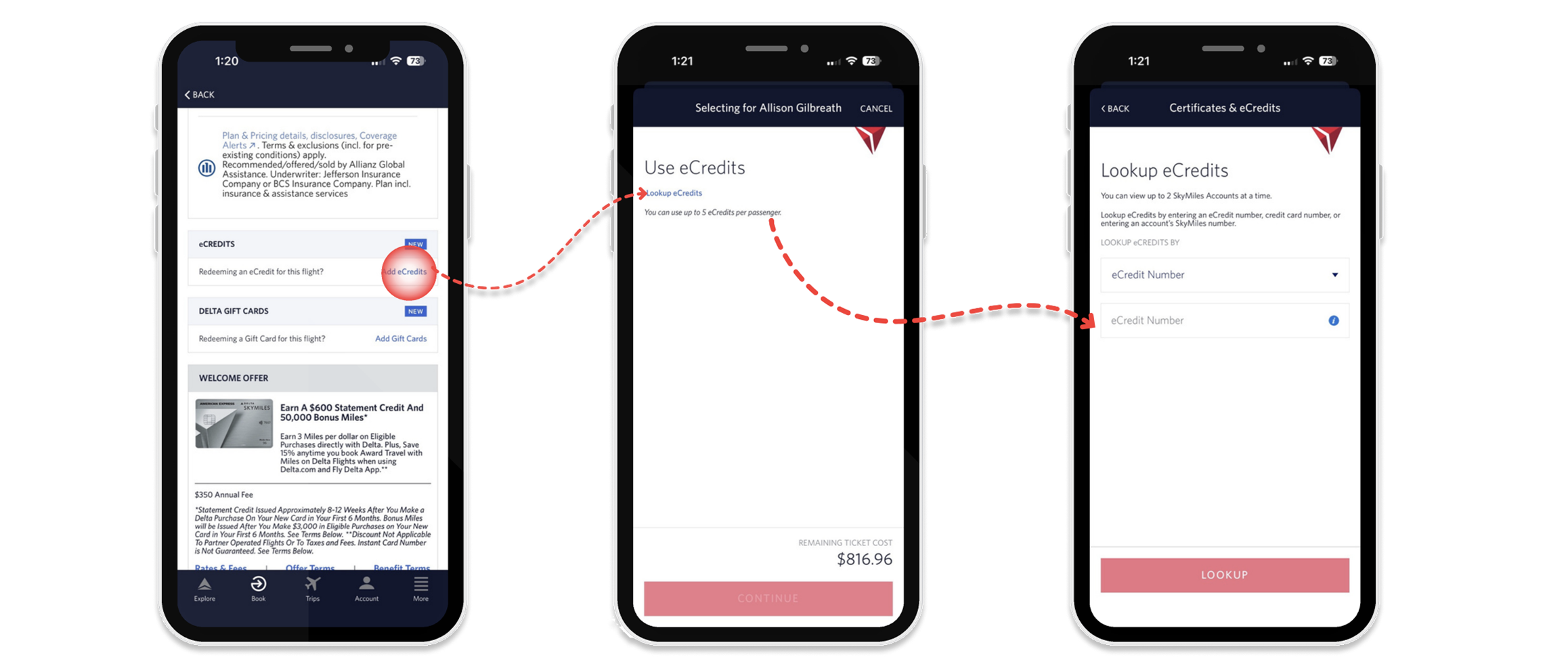
How users apply eCredits today: checkout, lookup, manual entry
These three problems compound each other. The result is a feature that lets users down precisely when they need it most.
by accident or by design?
A dark pattern is when a design is built in a way that looks normal on the surface but quietly works against the user, usually in a way that benefits the company.
The eCredits experience checks all the boxes. A feature that's buried, broken, and requires you to dig through your email just to use money Delta already owes you means a lot of people are going to give up. And when they give up, they rebook at full price, Delta keeps the money. This is especially true for older travelers or anyone who isn't deeply comfortable switching between apps, copying codes, and navigating back mid-checkout. What feels like a minor inconvenience to some is a full dead end for others.
Maybe that's intentional. Maybe it's just poor design, a broken page nobody fixed, or a team that had other priorities. It's impossible to know from the outside.
Whether the friction is on purpose or not, the user experience is the same. For a brand that wants people choosing Delta every time they fly, quietly frustrating your loyal customers at their most stressful moments isn’t a great strategy.
recommendations
before
after
recommendation 1
Reduce the cognitive load at checkout.
Right now, applying an eCredit at checkout requires finding a small link buried between insurance offers and gift cards and loads of text, leaving the app to look up a code from a confirmation email, and entering it manually before you can continue.
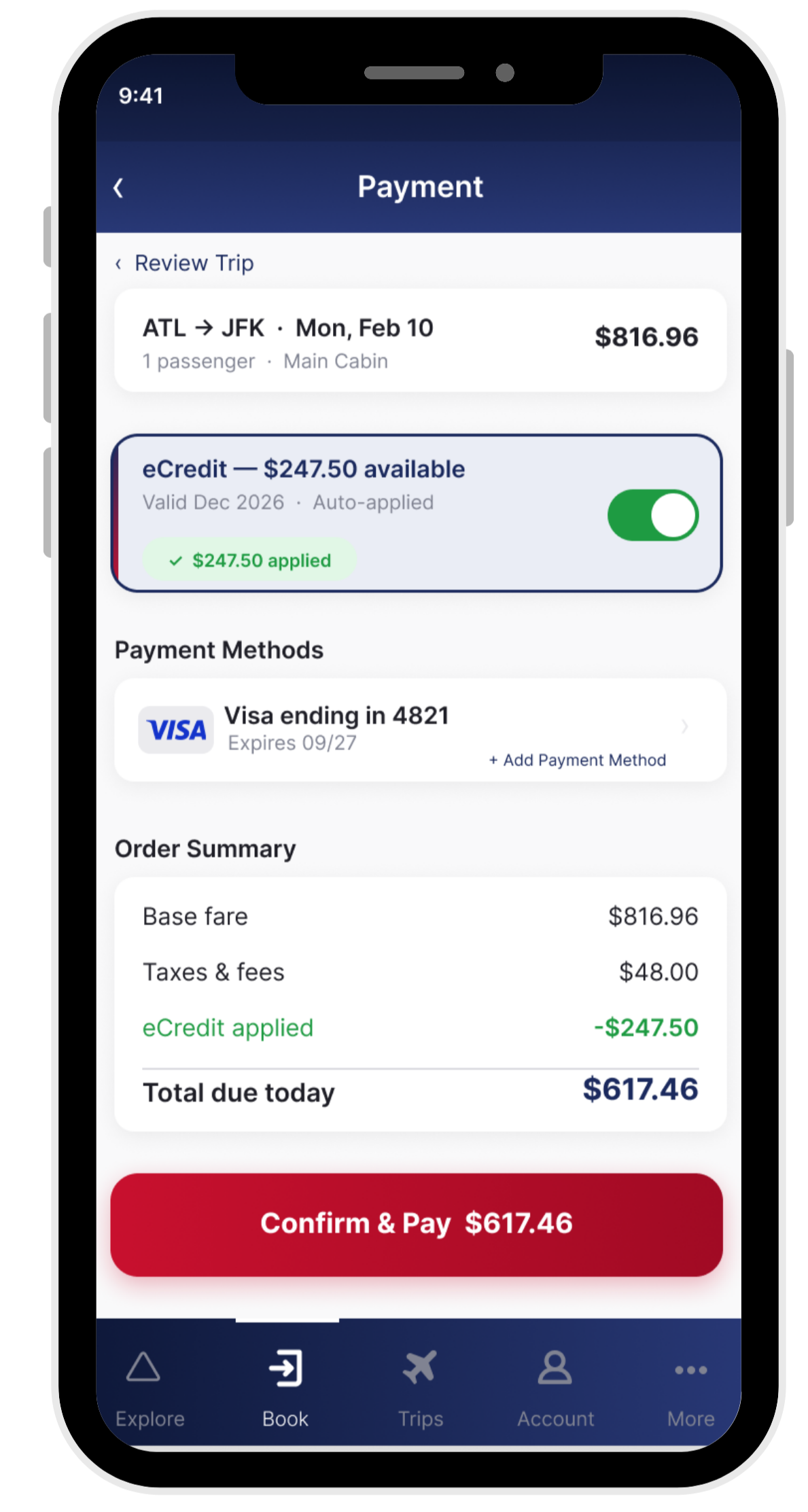
The redesigned checkout surfaces your available eCredit automatically toggled, with the balance shown upfront and the credit already applied. The savings reflect instantly in the order summary checkout screen.
recommendation 2
Fix the manual entry experience.
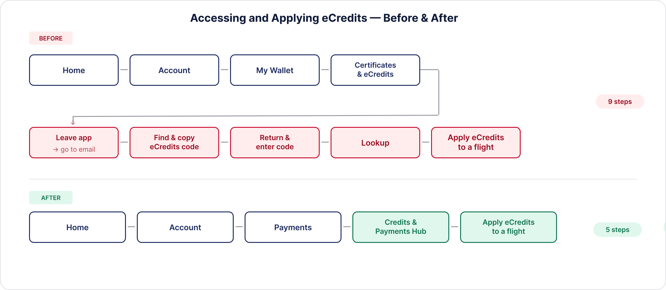
Right now if you want to use your eCredits, you have to leave the app entirely. You dig through your email for the voucher code, copy it, come back to the app, and manually enter it into a lookup form. Then you can finally apply it to a flight. That is nine steps to use money Delta already owes you.
The redesign creates a dedicated Credits & Payments Hub that pulls your eCredits automatically. You see your balance the moment you open it. You see whether it's active, what it's worth, and when it expires. Tapping "Apply eCredits to a Flight" takes you straight into booking with your credit ready to use. No email. No code. No detours.
recommendation 3
Simplify Account - Two tabs, one clear purpose.
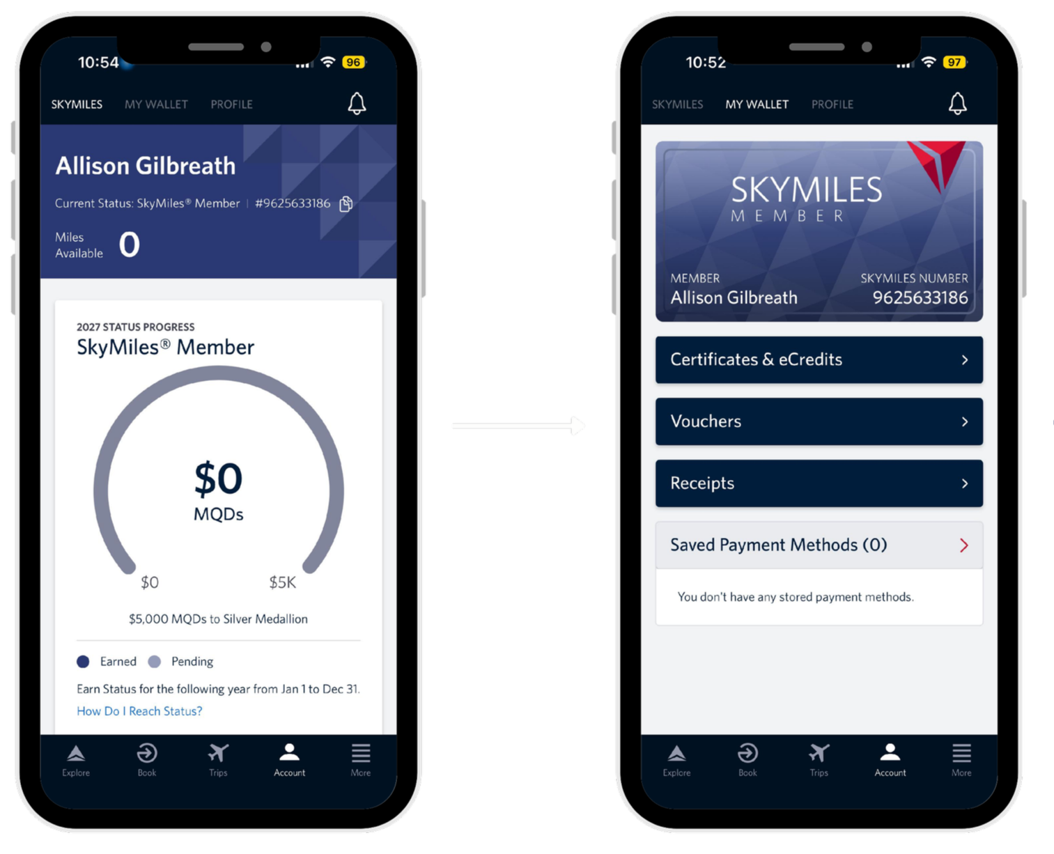
before - account home
Right now, Account opens to the SkyMiles tab, with My Wallet and Profile sitting alongside it. To find your eCredits you have to tap into My Wallet, then hunt for Certificates & eCredits buried in the list. There is no balance shown, and no indication you have anything available.
before - ‘my wallet’ tab
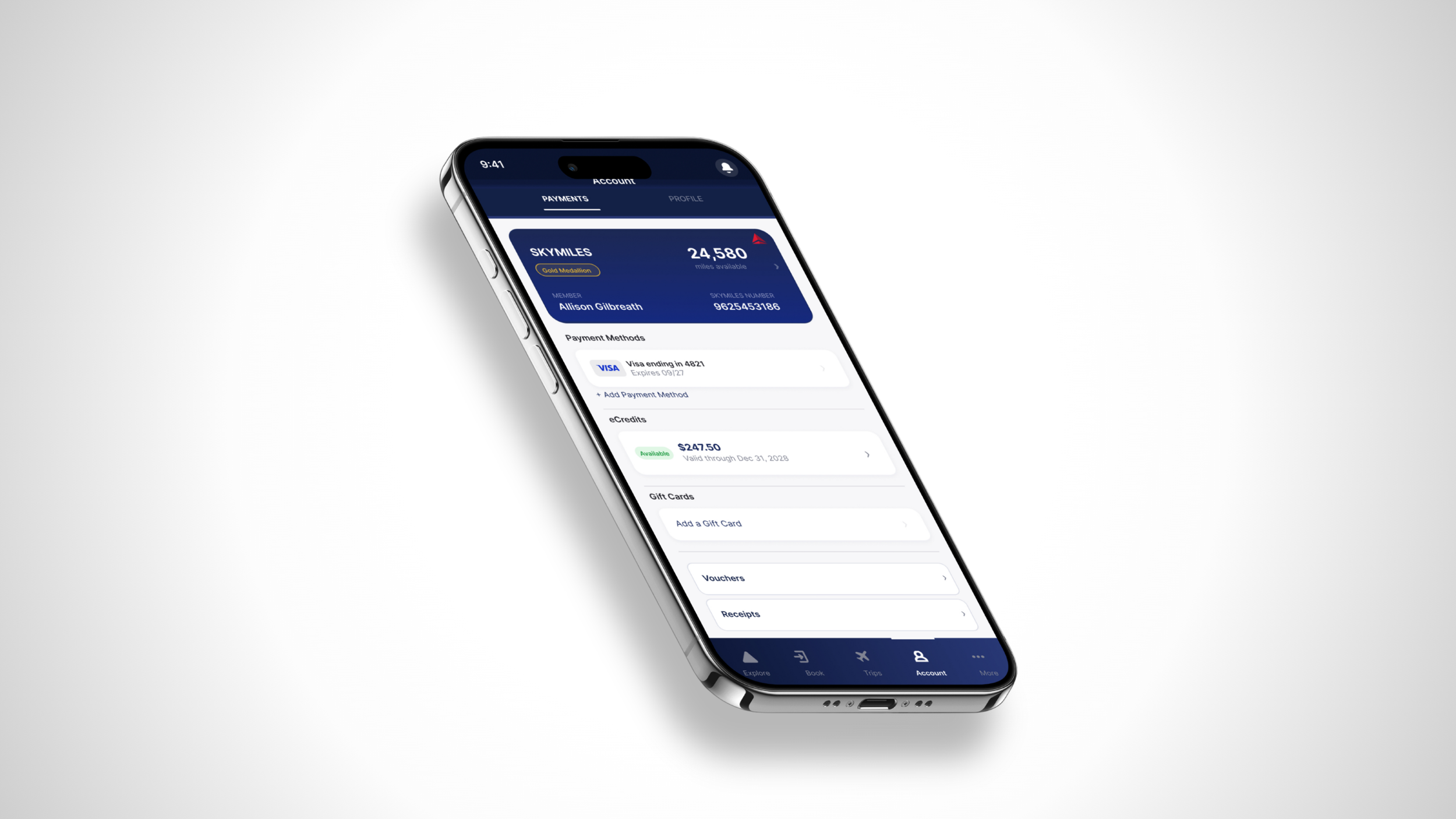
after - redesigned account tab
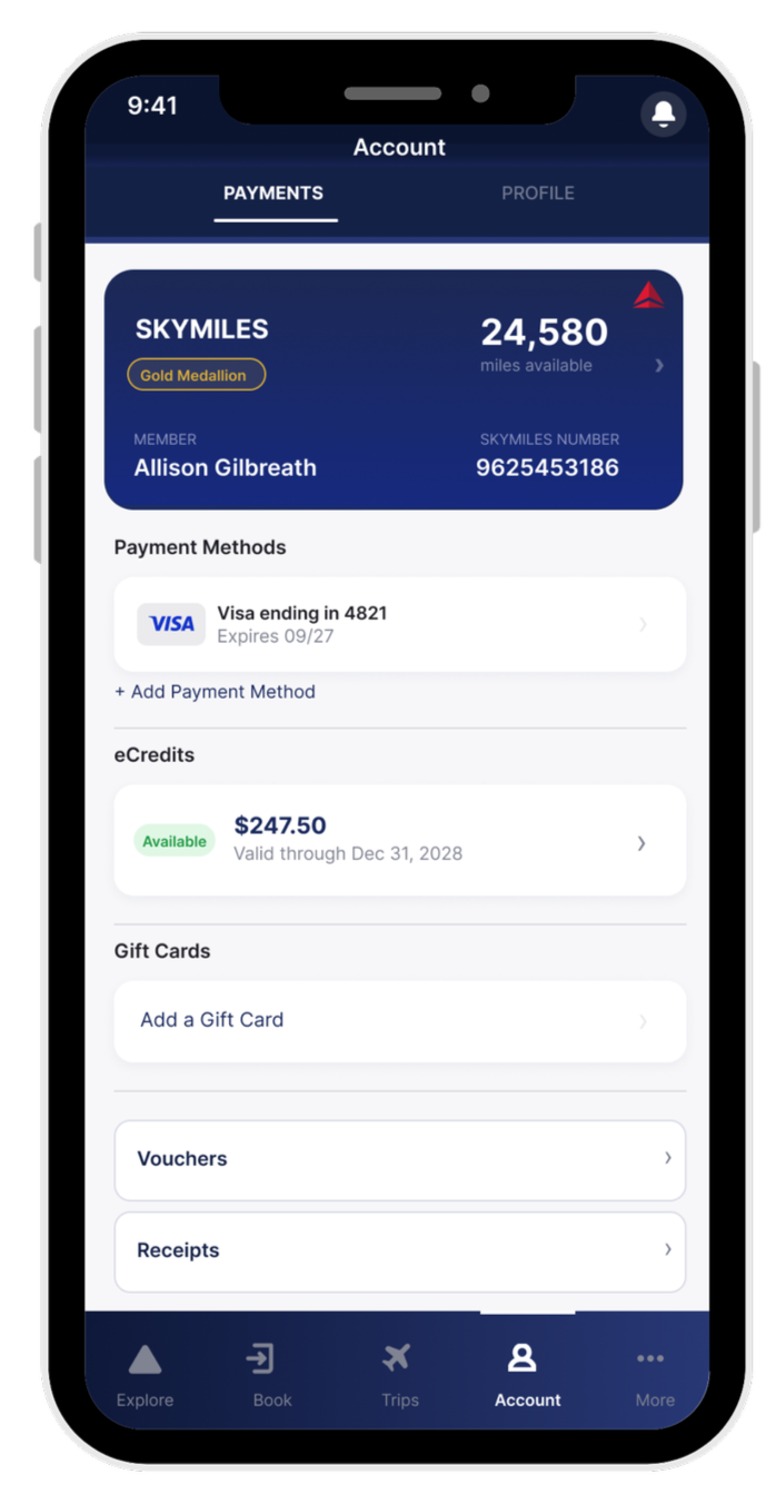
The redesign collapses Account into two tabs: Profile and Payments. Your SkyMiles card sits at the top of Payments with balance and Medallion status visible, tappable for more detail. Below it, Credits & Payments shows your eCredit balance upfront before you even tap in. This design keeps everything financial in one place. You land on Account and you already know what you have.
reflection
This project started from a genuinely frustrating experience and I think that made it stronger. When the starting point is something that actually happened to you, the problem statement writes itself. I didn't have to search for a problem worth solving. I just had to pay attention to my own frustration and follow it.
The dark patterns section pushed me to ask a harder question than I expected. Not just what was broken, but whether it was broken on purpose. That reframe changed how I thought about the whole project. It stopped being a bug report and started being a critique with a point of view.
This project reminded me that the most compelling user experience problems aren't always abstract. Sometimes they're just things that happened to you that nobody fixed yet and personal experience is a valid research starting point. The key is knowing when to zoom out from your own story and design for everyone who's had the same one.
One tension worth naming is that Recommendation 3 works against Delta's incentive to keep SkyMiles front and center. Their app is built around loyalty, and Skymiles are the engine. But a user who can easily find and use their eCredits is more likely to rebook with Delta than one who gets frustrated and books elsewhere. Good UX and good business don't have to be at odds. In this case I'd argue they're pointing in the same direction.
what I would do differently